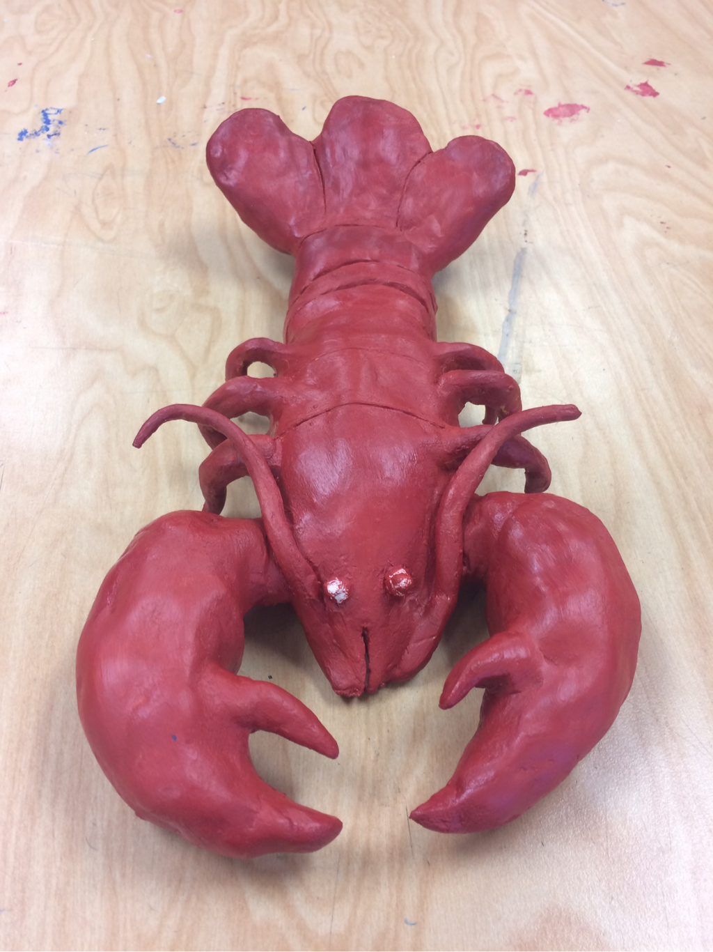
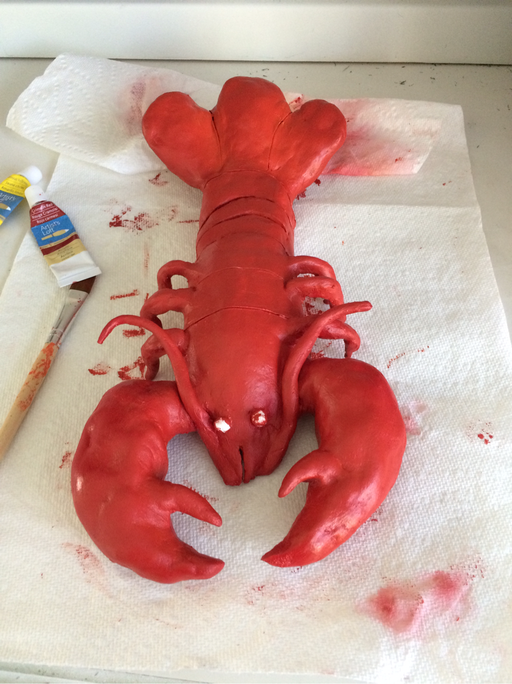
Clay Foods Critique:
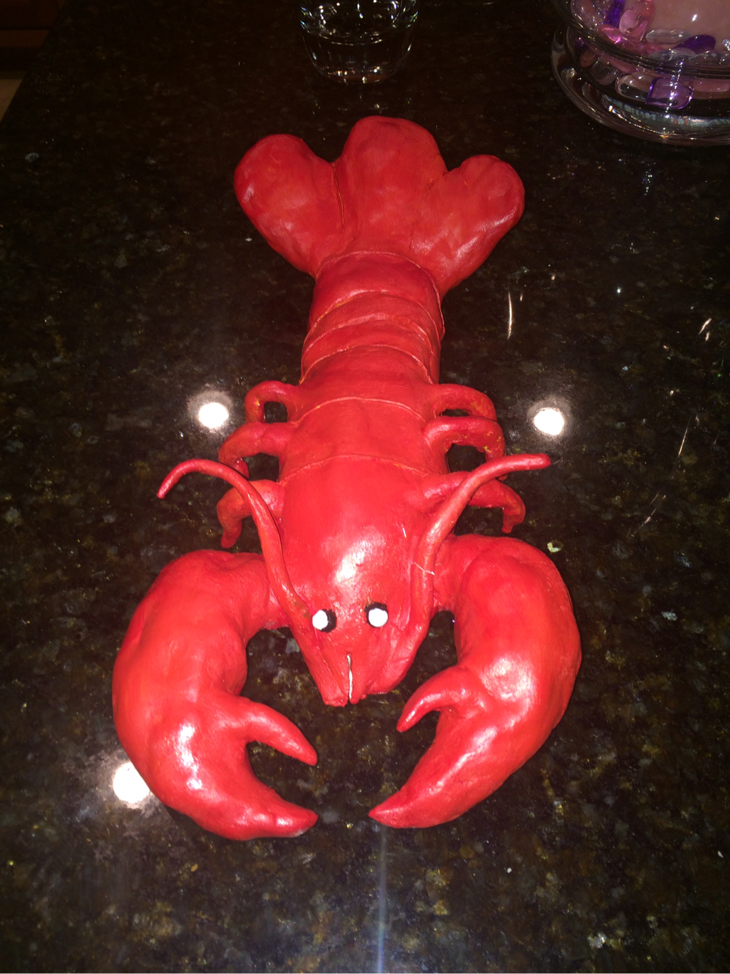
1. The craftsmanship of my lobster is very well executed. All shapes are defined and in relation to the size of the lobster. Two large claws are extended in front of the lobster, I made the left claw slightly bigger than the right as it is naturally. Both the legs and tail are symmetrical on either side. The body of the lobster was made by the pinch pot technique to be hollowed, the claws and tail are also hollow. When making the antenna and eyes I rolled clay andascetically place them on my lobster.
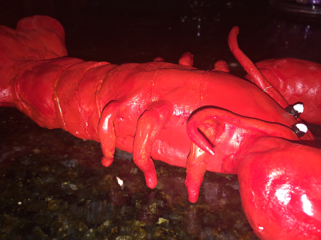
2. The most difficult part of this project was hollowing out the claws of the lobster. I often had to redo the size of the claw or the shape to match the other one. It was also difficult in placing paper towels inside the claws and shaping the claws with clay/with the paper towels.
3. My color choices worked together well through out my lobster. I chose the cooked red color to model my lobster. Although my lobster mainly consists of red, there are many orange and yellow highlights that added value to my lobster.
4. My sculpture is interesting from all views, including the profile view, frontal view, and overhead view. The profile view lets you see the detail in the lobster's legs and the frontal view let's you get a close up of its face.
5. When constructing a sculpture an artist has to think about multiple perspectives and the texture of the sculpture. In a 2D artwork an artist would maybe pay more attention to the colors of their artwork and color values to make it seem 3D; in a sculpture the artist will focus in size and shape.
6. I created texture in my sculpture by carving lines and ridges in the the lobster's body. I wanted to give the illusion it was flexible and realistic. The texture of some of the lines is smooth and thin; other lines are wide and course.
7. My sculpture looks like actual food because of the color, texture, and size. The size of the lobster and the size of the claws is realistic and resembles a cooked lobster. The color indicates the lobster is cooked and ready to be eaten. I accomplished the cooked lobster look with the color of the lobster and the resting state I modeled the lobster in to.
1. The craftsmanship of my lobster is very well executed. All shapes are defined and in relation to the size of the lobster. Two large claws are extended in front of the lobster, I made the left claw slightly bigger than the right as it is naturally. Both the legs and tail are symmetrical on either side. The body of the lobster was made by the pinch pot technique to be hollowed, the claws and tail are also hollow. When making the antenna and eyes I rolled clay andascetically place them on my lobster.
2. The most difficult part of this project was hollowing out the claws of the lobster. I often had to redo the size of the claw or the shape to match the other one. It was also difficult in placing paper towels inside the claws and shaping the claws with clay/with the paper towels.
3. My color choices worked together well through out my lobster. I chose the cooked red color to model my lobster. Although my lobster mainly consists of red, there are many orange and yellow highlights that added value to my lobster.
4. My sculpture is interesting from all views, including the profile view, frontal view, and overhead view. The profile view lets you see the detail in the lobster's legs and the frontal view let's you get a close up of its face.
5. When constructing a sculpture an artist has to think about multiple perspectives and the texture of the sculpture. In a 2D artwork an artist would maybe pay more attention to the colors of their artwork and color values to make it seem 3D; in a sculpture the artist will focus in size and shape.
6. I created texture in my sculpture by carving lines and ridges in the the lobster's body. I wanted to give the illusion it was flexible and realistic. The texture of some of the lines is smooth and thin; other lines are wide and course.
7. My sculpture looks like actual food because of the color, texture, and size. The size of the lobster and the size of the claws is realistic and resembles a cooked lobster. The color indicates the lobster is cooked and ready to be eaten. I accomplished the cooked lobster look with the color of the lobster and the resting state I modeled the lobster in to.
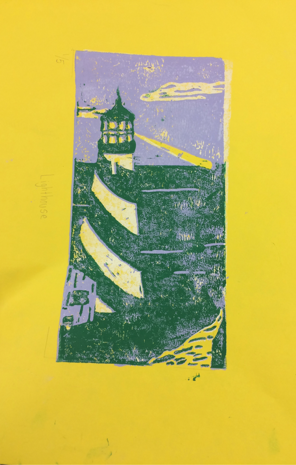
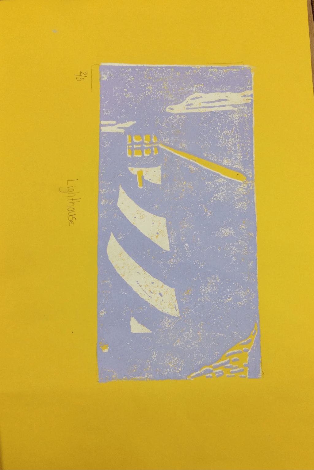
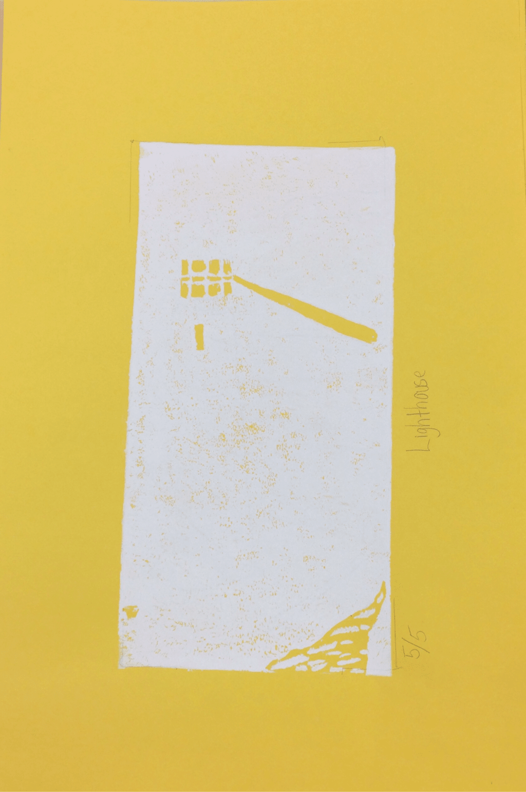
Four Color Prints:
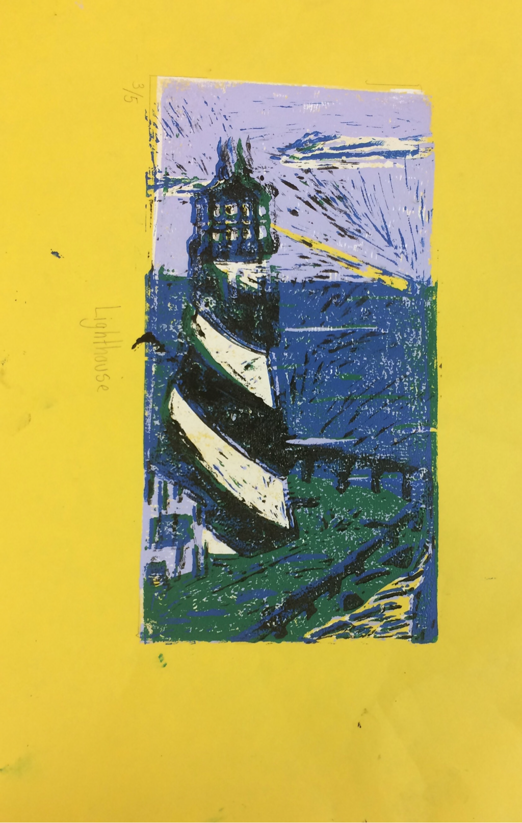
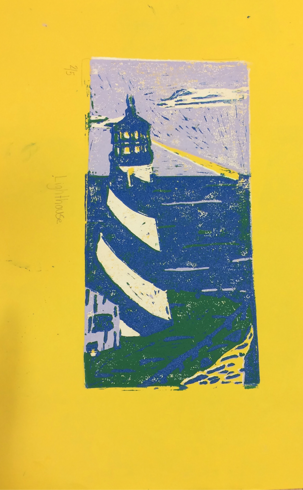
1. The craftsmanship of my pieces were well executed, I made
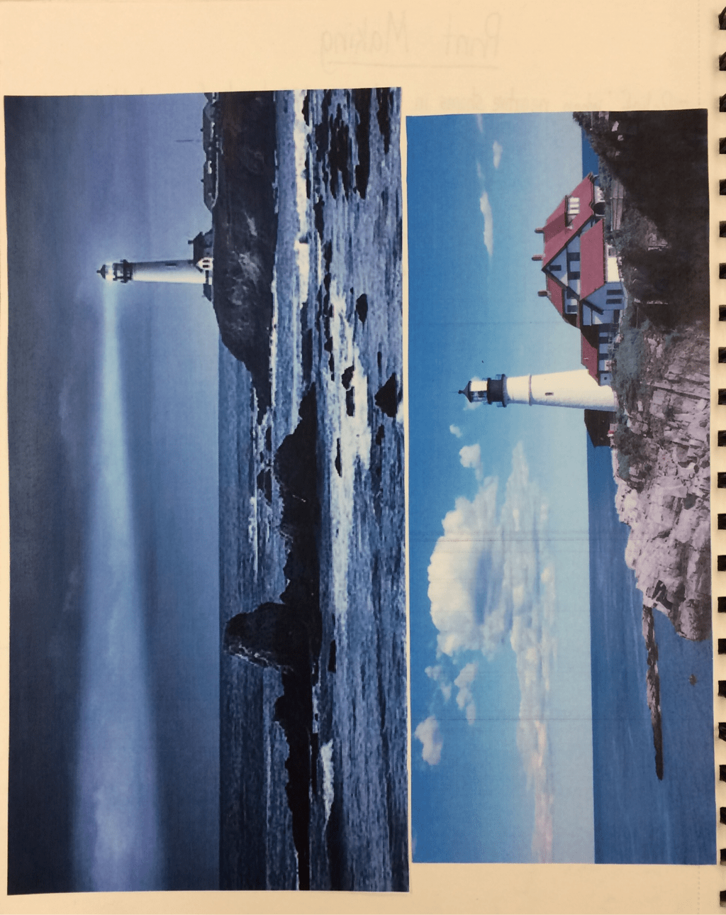
an effort to crave out details. However, in some parts of my print it appears I did not cut deep enough, as evident in some parts of the sky where there are streaks. I succeed in registration of the piece for the most part. I correctly lined up the ocean and the land as well as the sky but the top of the lighthouse was more difficult to a line. I did very well when covering the linoleum with ink and applying it to paper. The sky and the sea are especially well saturated with color.
2. I used texture to define the choice of my subject by showing the ripples in the ocean, the edges in the cliff and the character of the house. I used color harmony to define my lighthouse by using mainly colors from the cool color family to balance the appeal of my colors against the yellow paper.
3. If I could recreate my piece I would carve deeper to get the dark lines out of the sky and I would line the linoleum up more carefully.
1. The craftsmanship of my pieces were well executed, I made
an effort to crave out details. However, in some parts of my print it appears I did not cut deep enough, as evident in some parts of the sky where there are streaks. I succeed in registration of the piece for the most part. I correctly lined up the ocean and the land as well as the sky but the top of the lighthouse was more difficult to a line. I did very well when covering the linoleum with ink and applying it to paper. The sky and the sea are especially well saturated with color.
2. I used texture to define the choice of my subject by showing the ripples in the ocean, the edges in the cliff and the character of the house. I used color harmony to define my lighthouse by using mainly colors from the cool color family to balance the appeal of my colors against the yellow paper.
3. If I could recreate my piece I would carve deeper to get the dark lines out of the sky and I would line the linoleum up more carefully.
Print making lighthouse progress pictures.
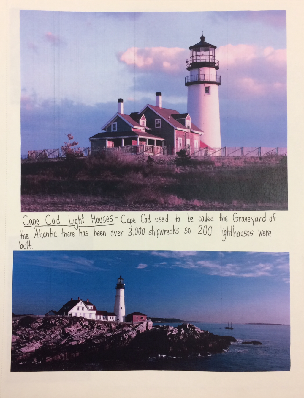
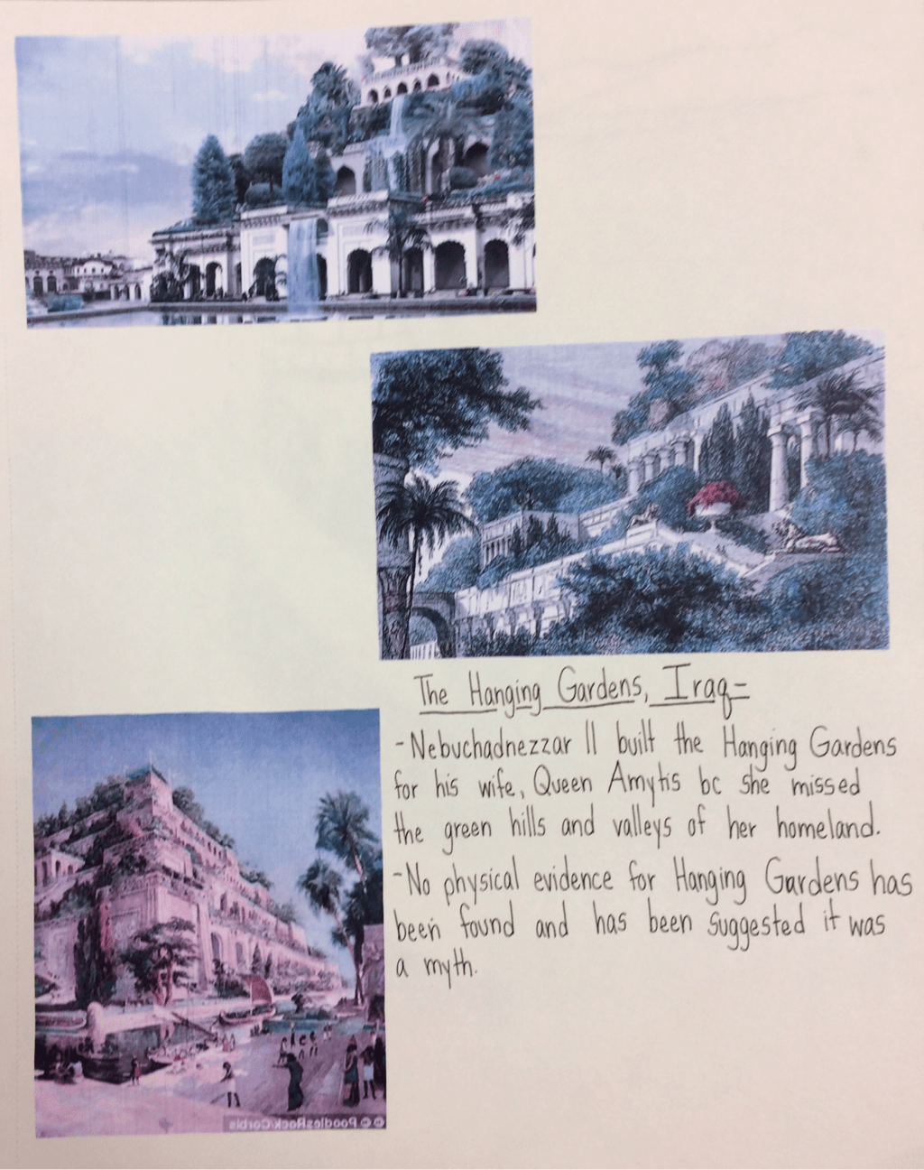
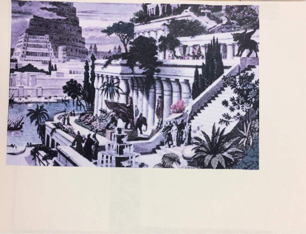
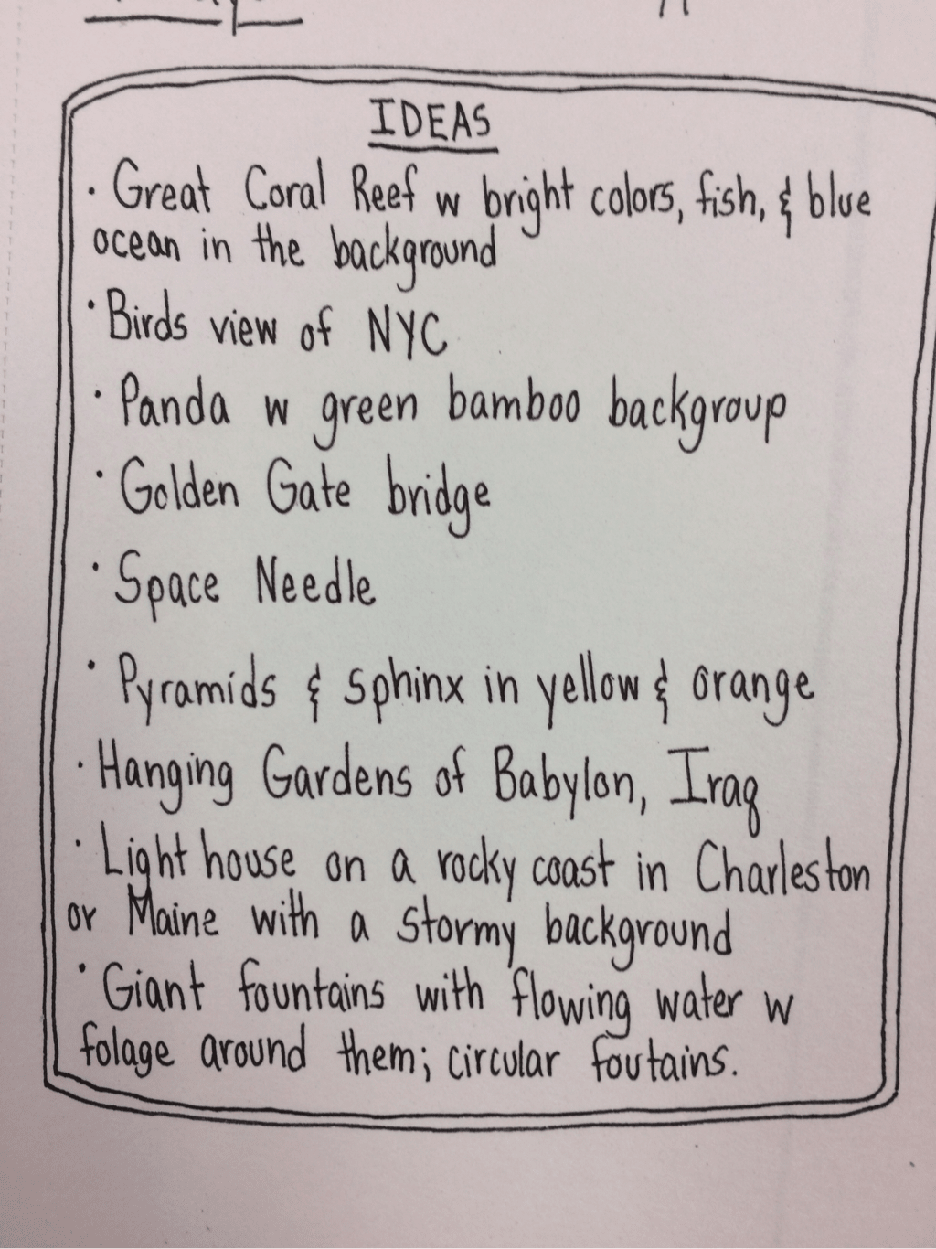
Print Making ideas and reference pictures.
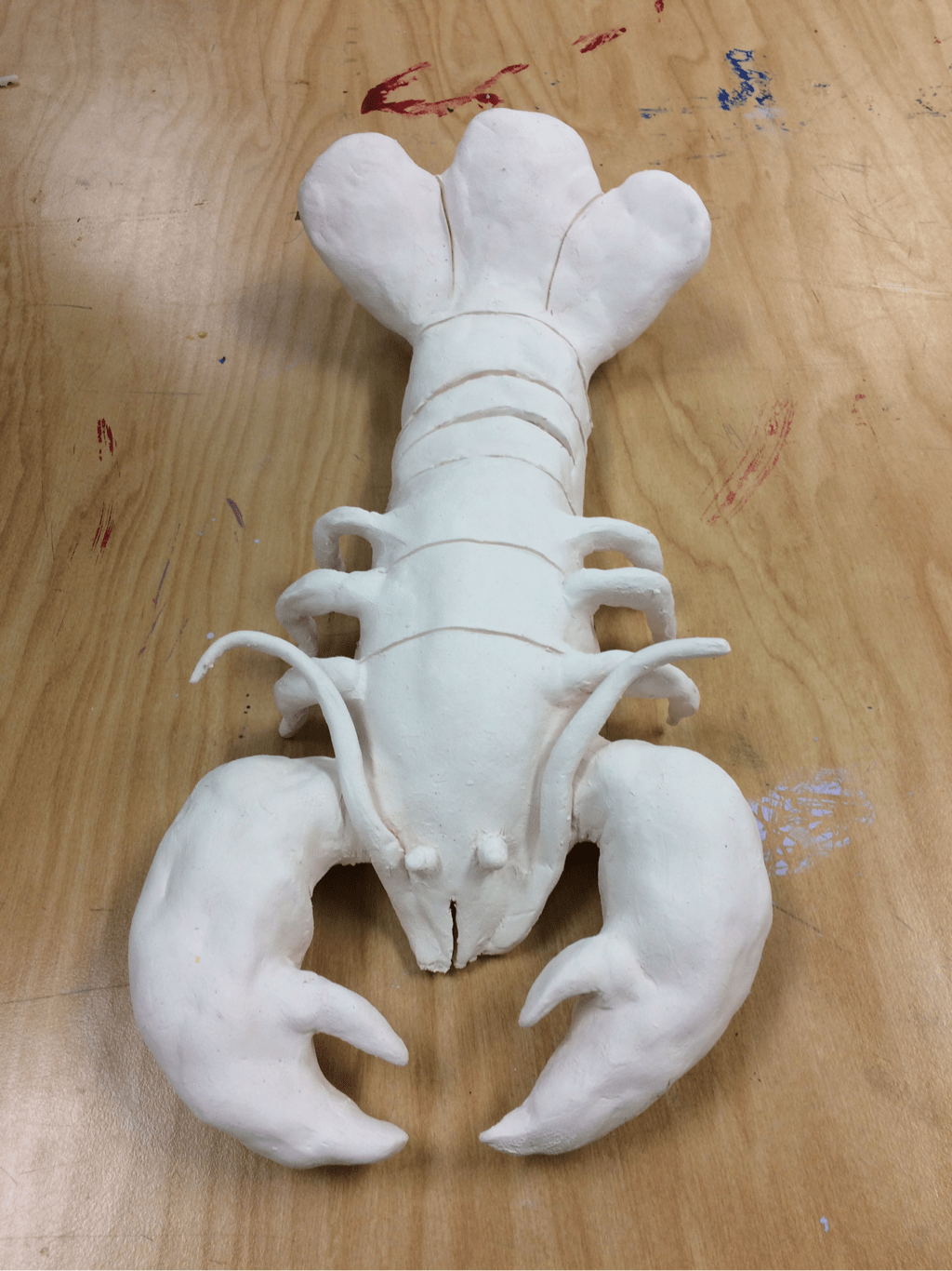
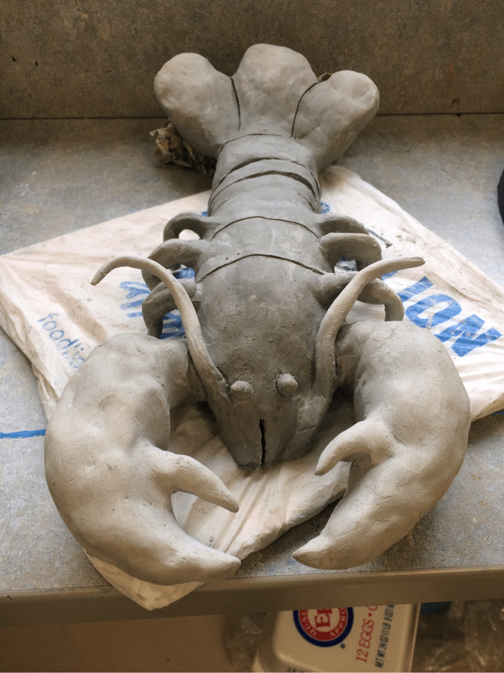
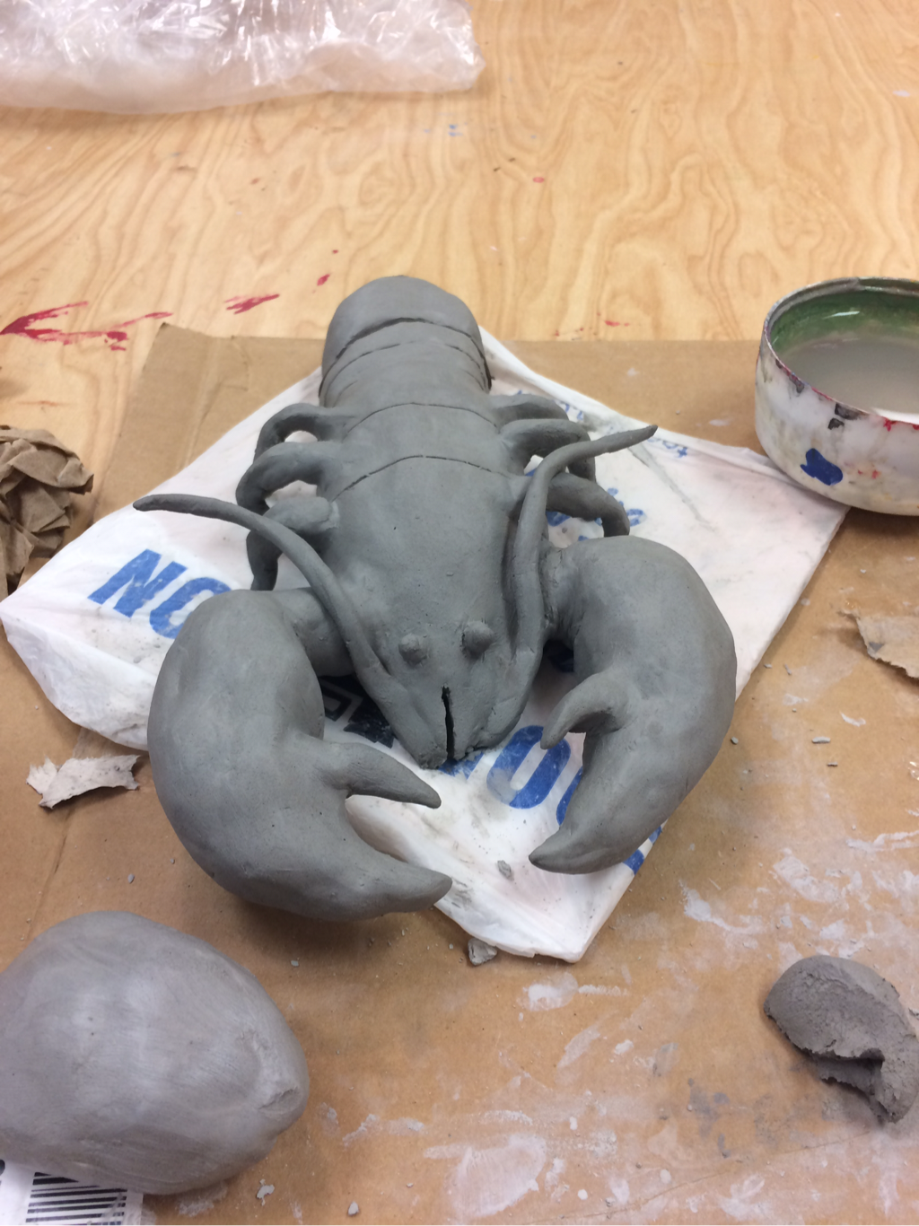
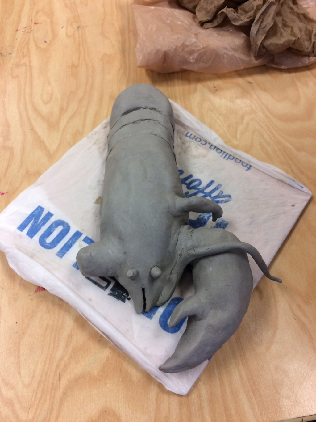
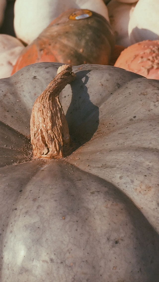
In progress Clay Food Project lobster pictures.
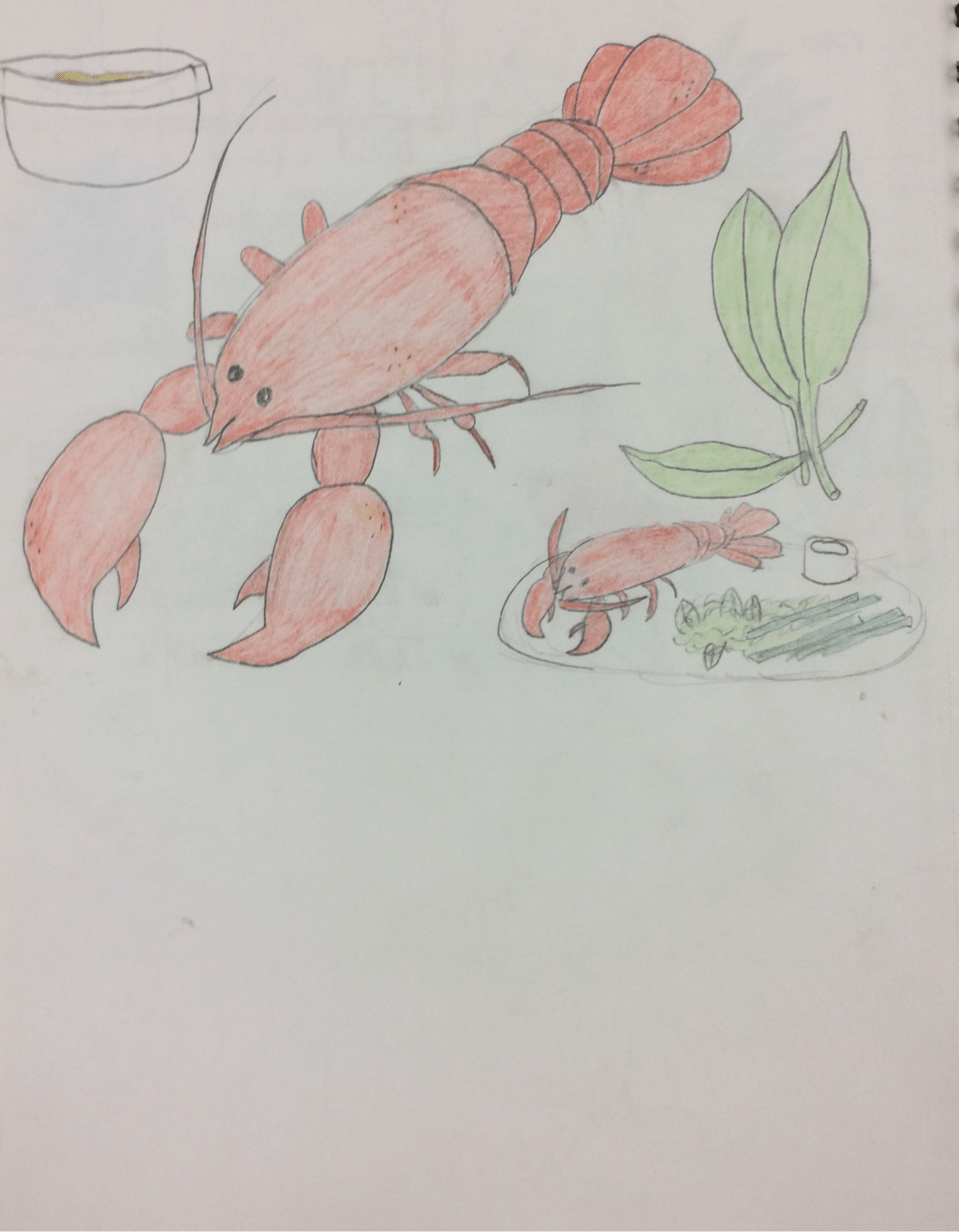
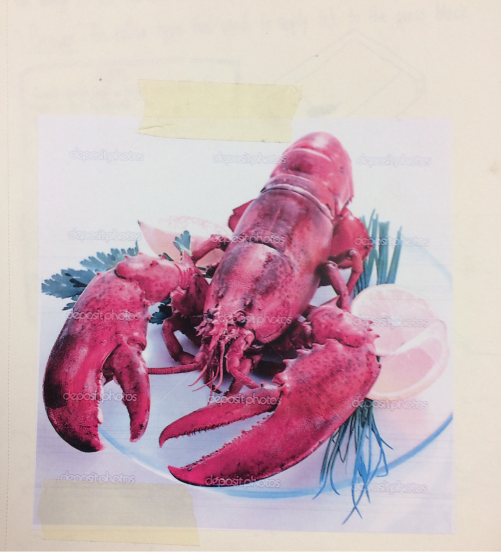
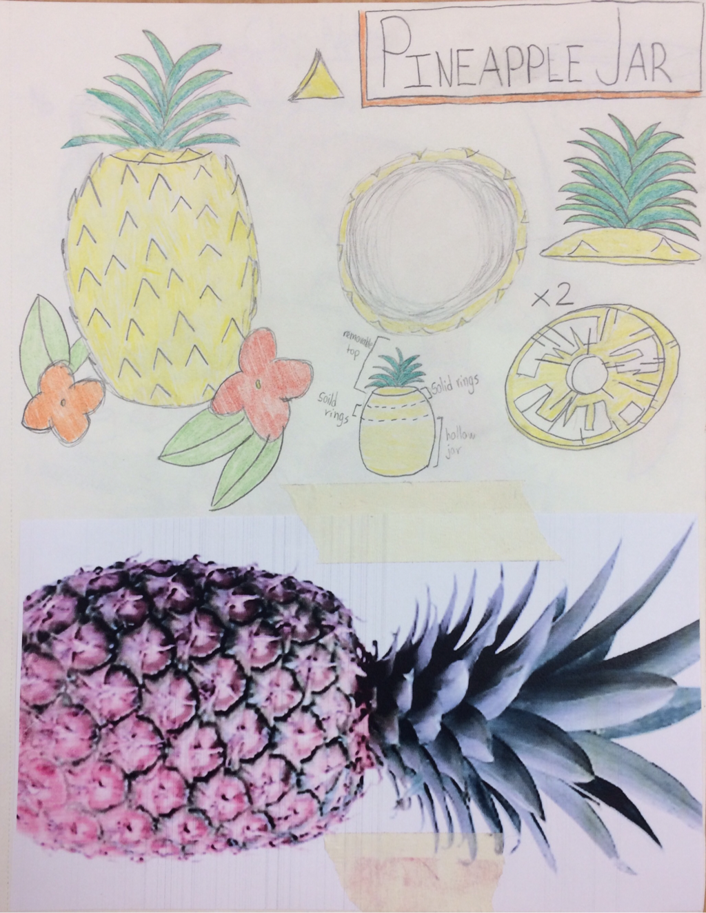
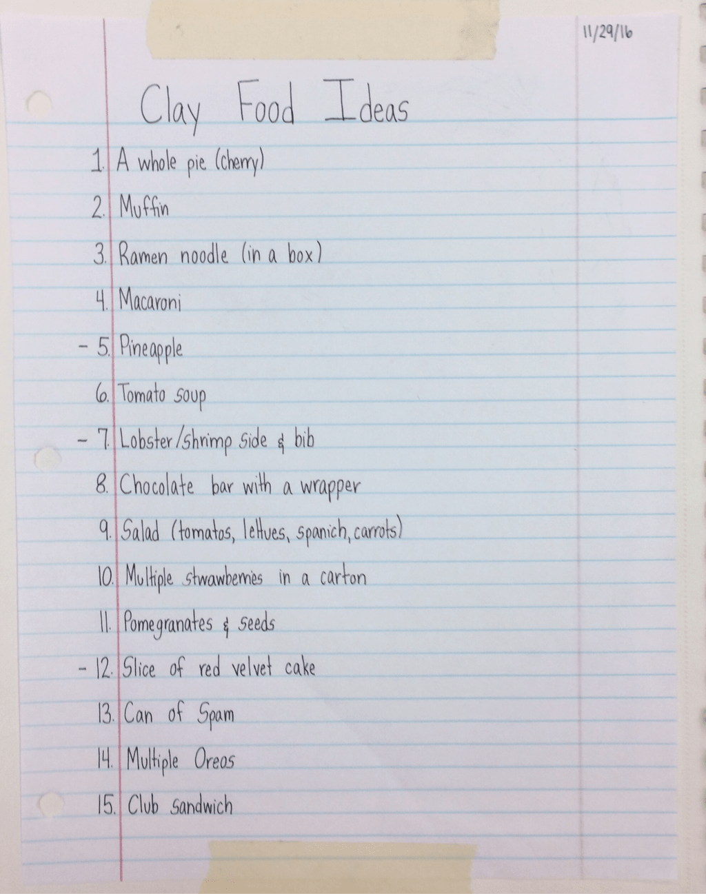
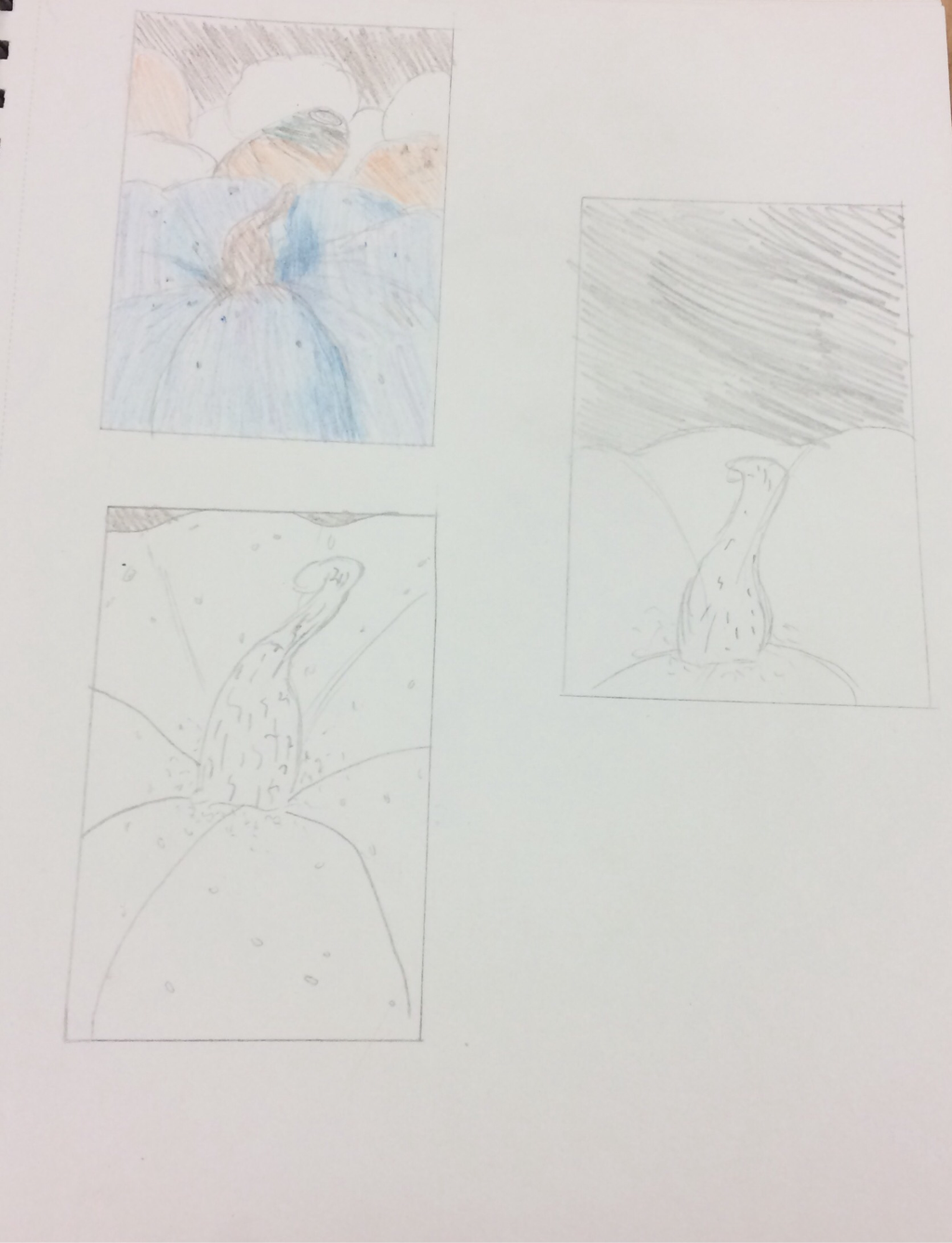
Clay Food Idea Sketches and reference pictures.
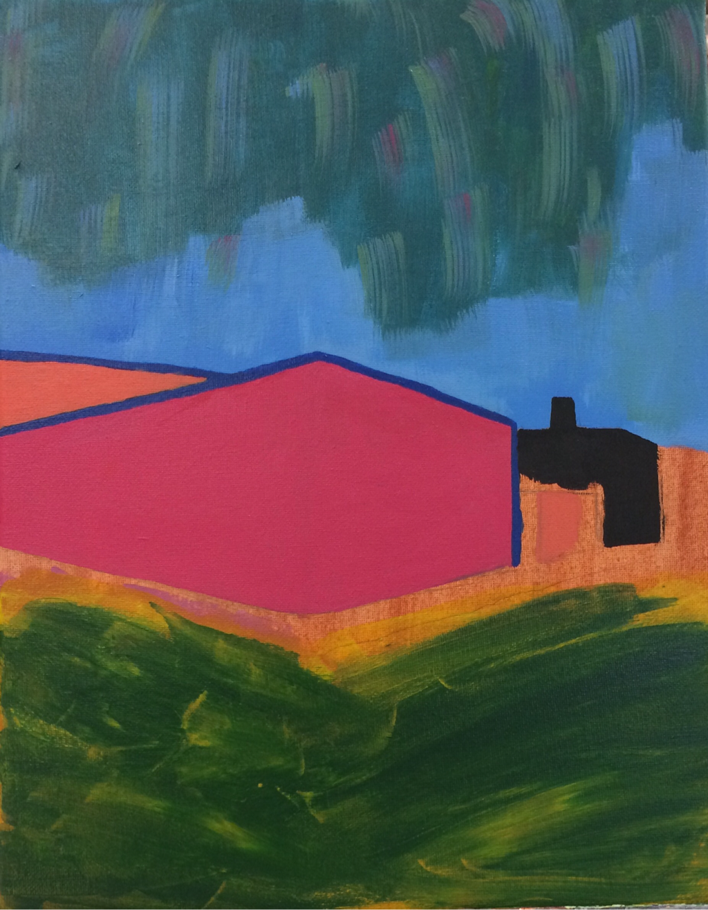
Landscape In the Sytle of an Artist Critique:
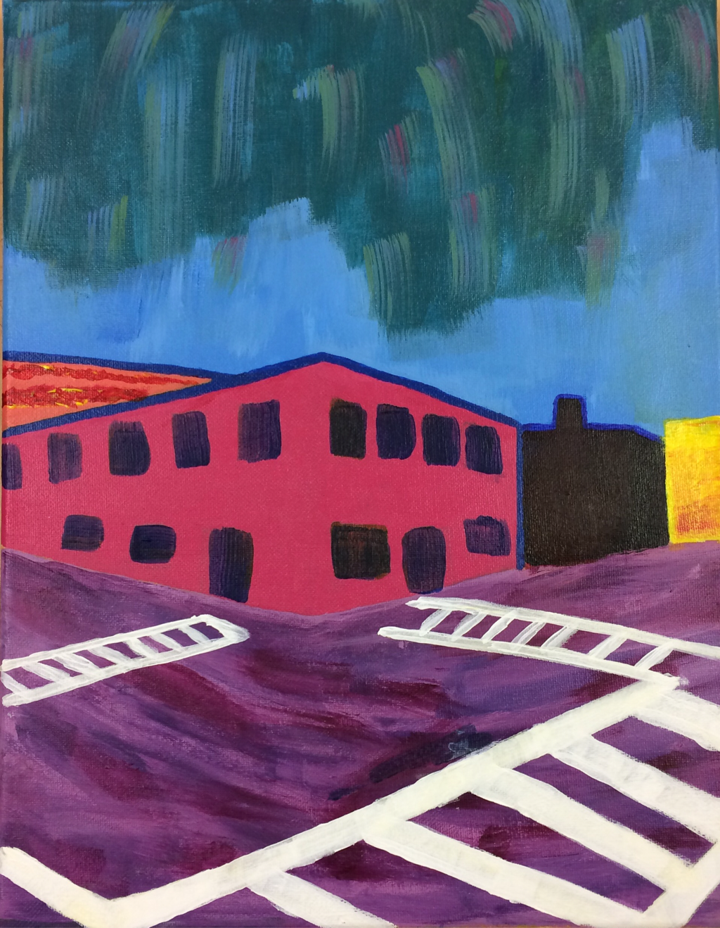
1. My reference art tist for the painting was André Derain. Four main ideas for creating my painting were- (1)André Derain's "Charing Cross Bridge"which inspired me to paint a scene of brightly colored buildings with little detail.(2)André Derwin's "Landscape near Chatou" gave me the idea to outline the buildings in my paintings a dark blue color, and use bright uncharacteristic colors for the buildings. (3) André Derain's "Charing Cross Bridge" inspired me to paint an unnatural sky color based off the yellow one in the original painting. (4) André Derain's "The Trees" gave me the idea to keep my painting simple and without much value.
2. My craftsmanship on this painting is unique. The strokes and lines on my buildings are neat and exact, remaining relatively clean. My brush strokes for my sky and street are much looser and free flowing; color is blended and smeared on these parts of the painting.
3. The most difficult part of this project was continuously reminding myself to paint in the style of André Derain rather than my own technique. I disagreed with some of the shapes of objects and how they were painted, making some objects awkward next to others. Since André Derain and I have contracting painting styles, I found it hard to use unnaturally bright colors for some objects.
4. By using bright color choices I was able to reflect André Derain's work. Since bold primary colors are a key indicator of an André Derain painting I made sure to incorporate these elements. The streaks in the bright blue/turquoise sky reflects Derain's unnaturally painted skies. The purple textured road reflects his green or red roads in some paintings.
5.My style of landscape reflects André Derain's in a way because he most commonly painted cities. Derain's most popular/ most common paintings are of city life in places such as London or Paris; the busy streets and skylines were a reoccurrence in many of his artworks. I followed his landscape style by choosing to paint a city street (a picture from downtown Charleston).
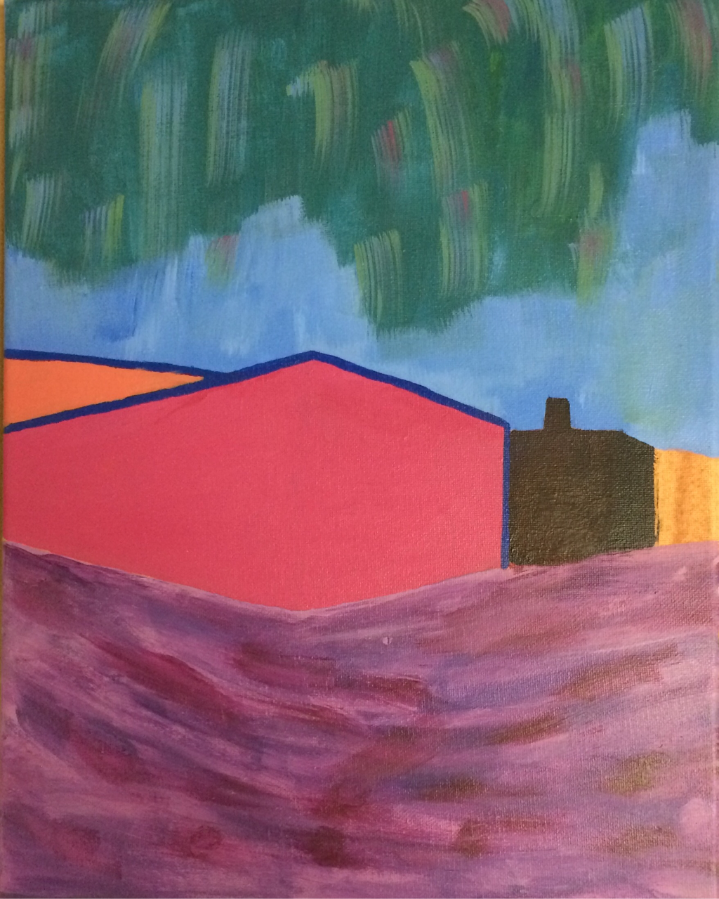
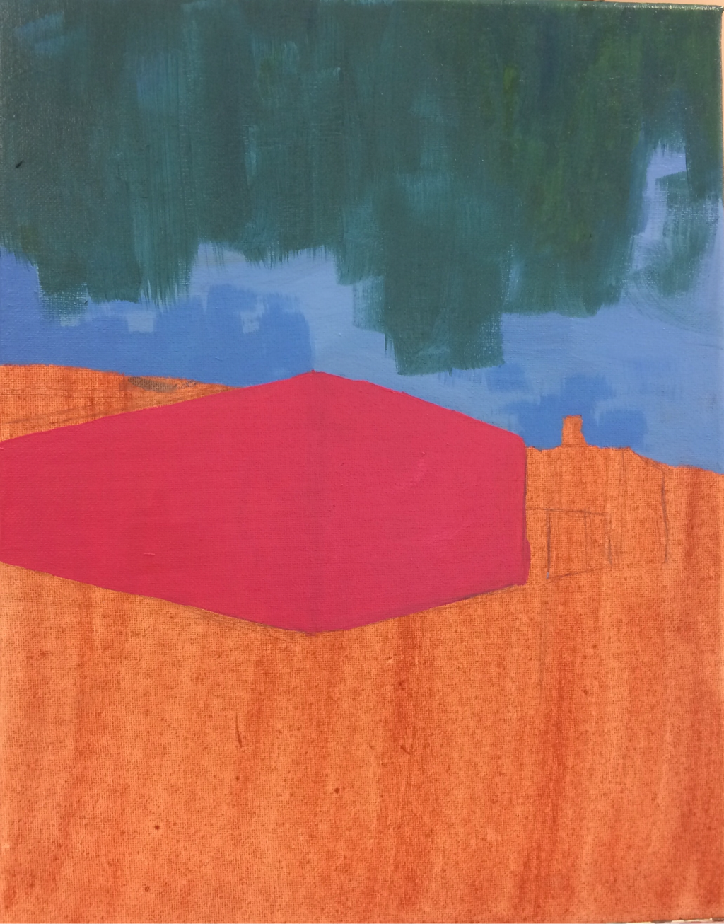
Landscape in style of artist progress pictures.
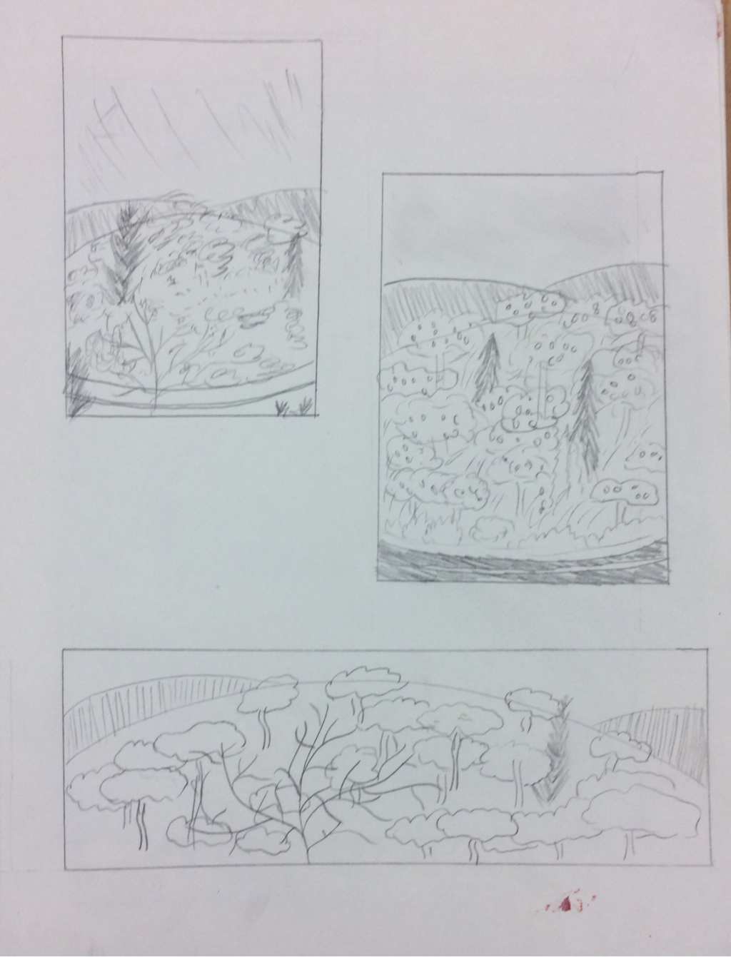
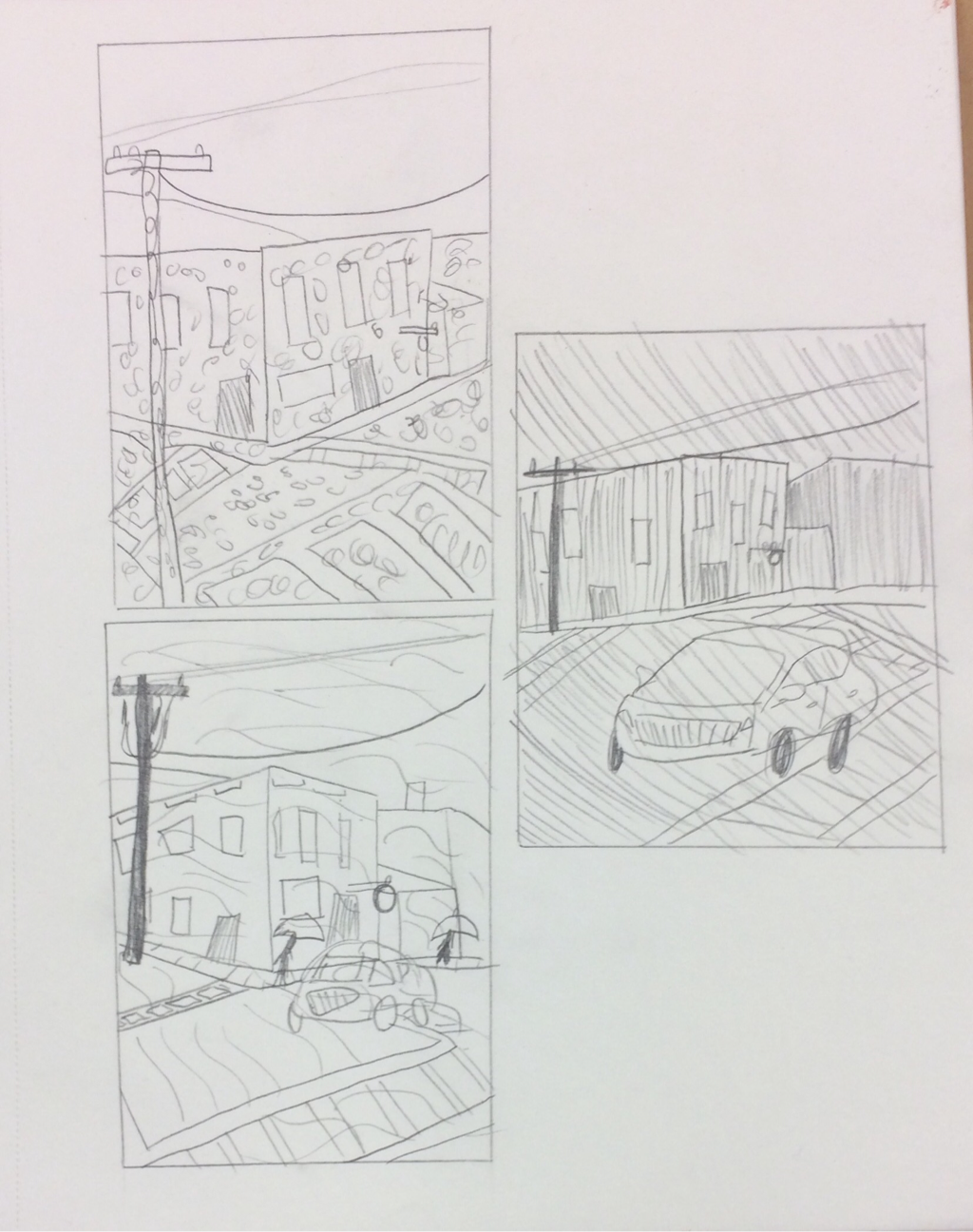
Sketches for Artist Style Painting: André Derain inspired sketches drawn loosely to mimick artist's style.
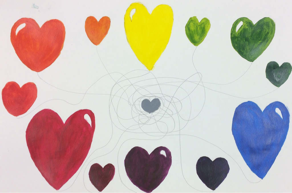
For color wheel I choose to paint hearts. I wanted to paint bright and plush hearts and they all connected to a gray heart in the center.
My color palette consisted of warm hues. The colors got lighter when they got closer to the white and darker when they got closer to the black.
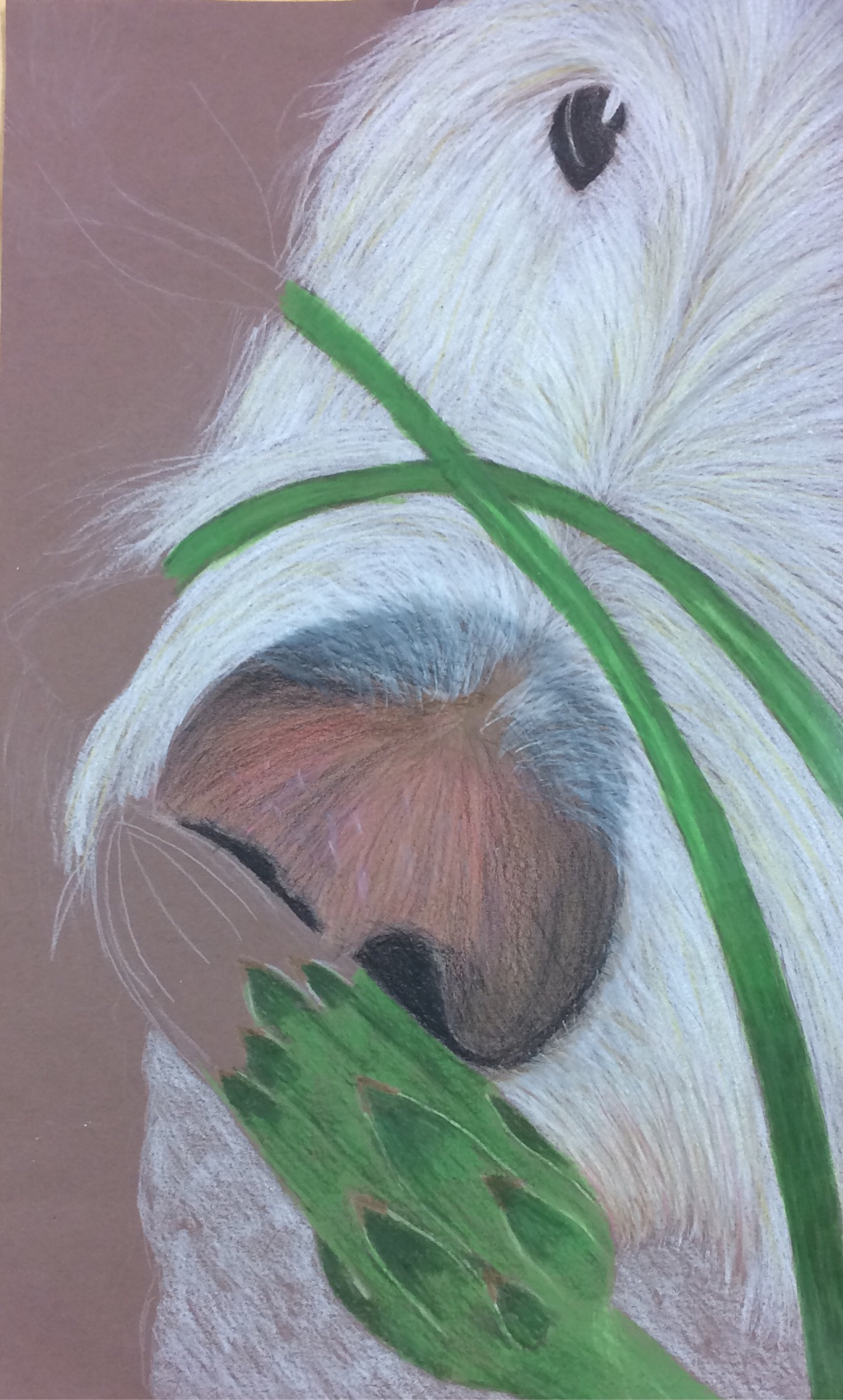
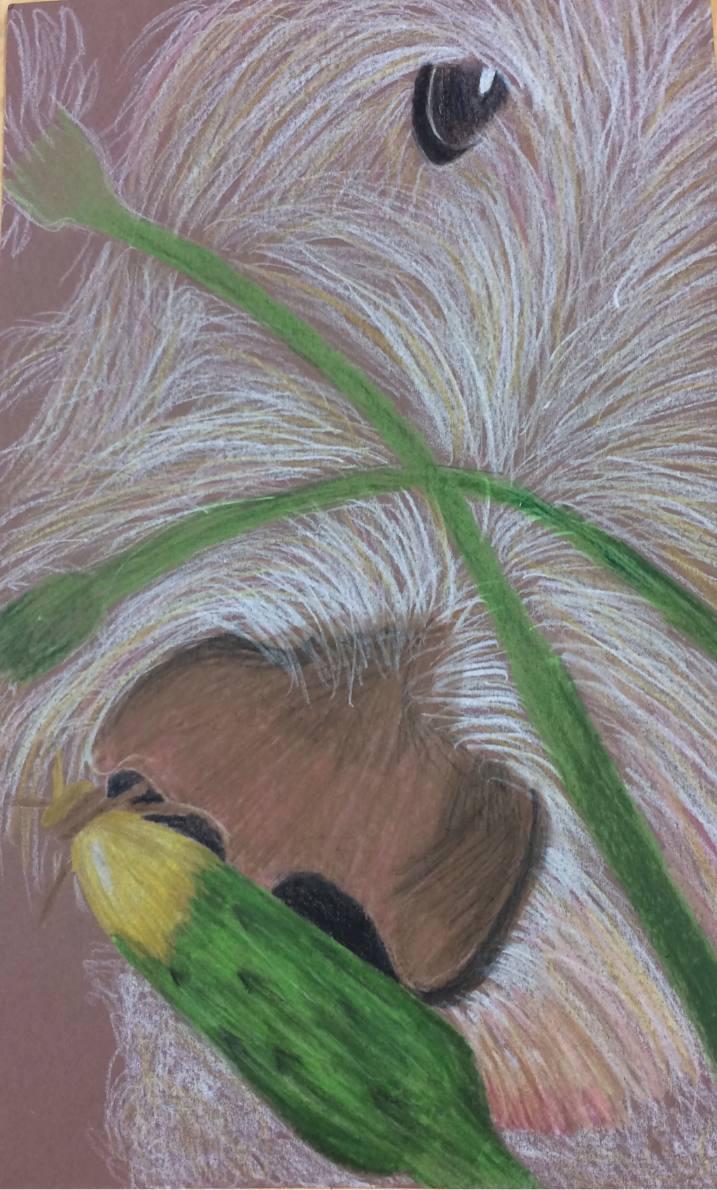
O'Keeffe Inspired Drawing Self Evaluation Questions:
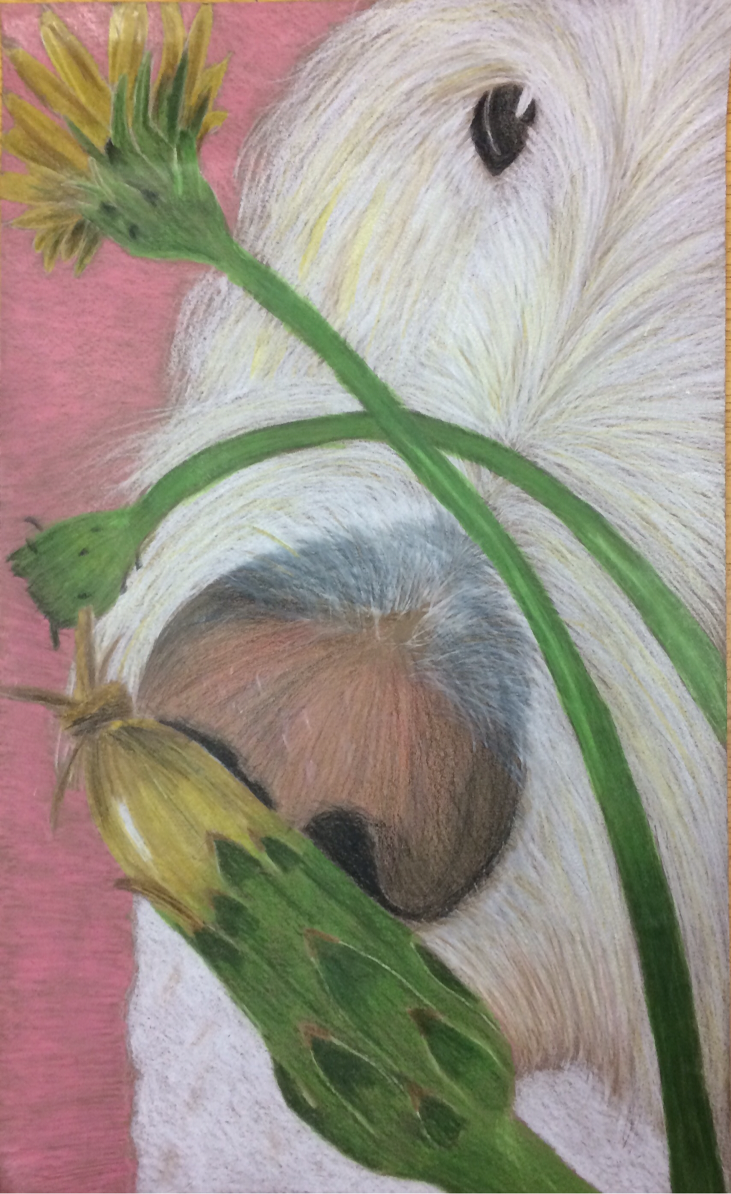
1. The craftsmanship of my drawing is well executed, my pencil lines are drawn in neat controlled curves that create texture. The correct amount of pressure has been used to make the color apparent and vibrate. Some of the shading on the nose could have been more controlled but over all my craftsmanship was successful.
2. I used a full range of white, yellows, browns, gold, pinks, reds, and greens to create the illusion of depth. An example of the use of depth can be found under and around the nose, as well as with the fur leading up the head and under the eye. Not only did I use colors from the previous color family from the original picture but I also incorporated streaks of unique color, such as the pink under the chin and in the fur.
3. I represented the style of Georgia O'Keeffe by incorporating her signature use of flowers in my drawing. I also used her close up technique on the face and particularly the nose of my dog. I represented O'Keeffe's style by adding value in to my drawing to make in appear realistic.
4. I chose the color white and yellow to make them stand out on my pink background. I used mainly warm colors to keep the harmony of not having huge contrasts within the dog itself. I used the color in the family-green as the stems and the yellow petals for the traditional dandelion. The brown/ pink nose also keep the colors in harmony with each other and tied in the background.
5. I created little contrast in my drawing however, I did contrast the colors pink and green and pink and brown. The green from the dandelion stems contrasted the pink background and thus made each stand out. The brown nose and pink background contrasted each other slightly enough to make themselves more apparent from the white fur.
6. The texture of the fur made my dog seem more realistic, I continually drew white lines for the fur until it layered enough to be distinct. The highlights of the fur also show if some pieces are standing up or are away from the face. The highlights on the dandelion leaves/petals helped to make them look real, as well as the white reflection on the two dandelion stems.
7. I had difficulty drawing the nose and creating the color of the nose. I would improve the shape of the dandelion petals and I would make the ear more distinct from the face. I would also make the eye bigger. Overall I was satisfied with the out come of my drawing.
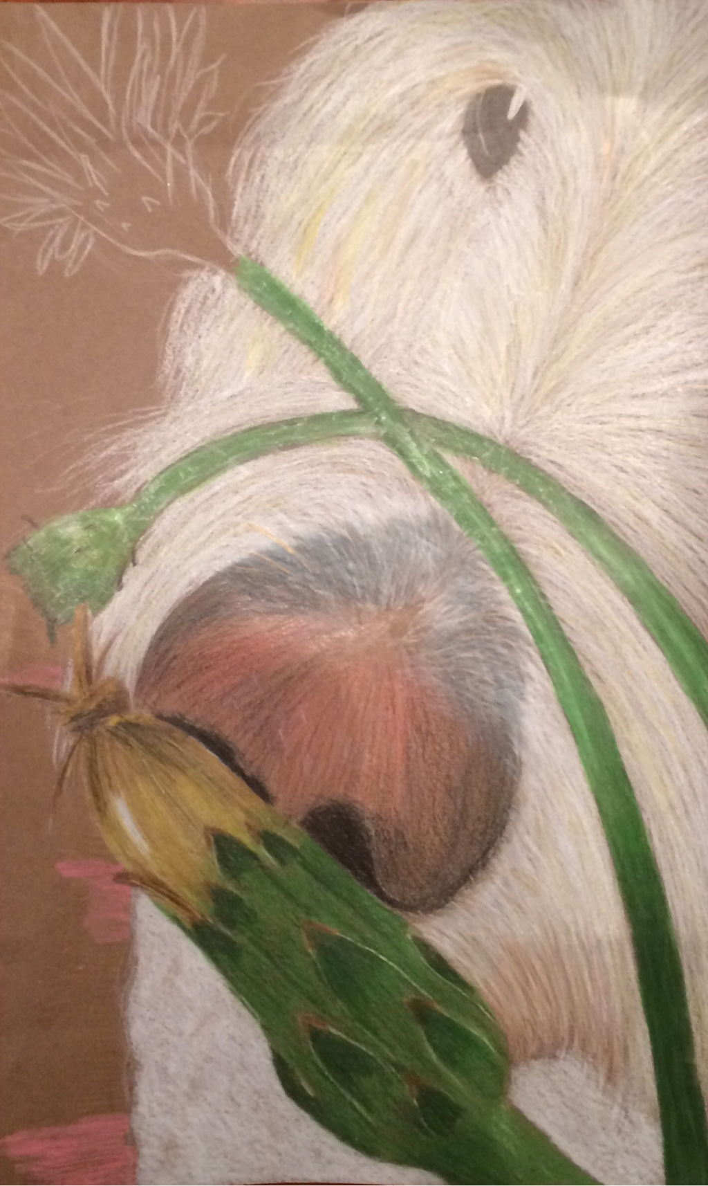
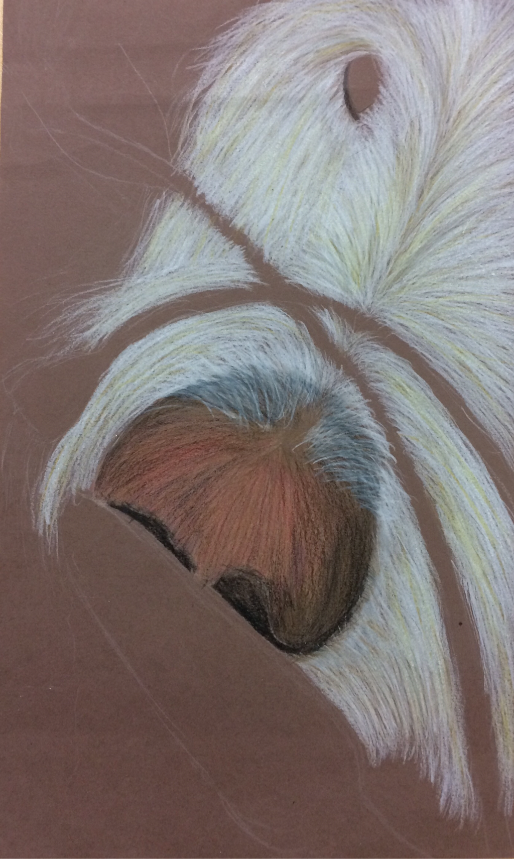
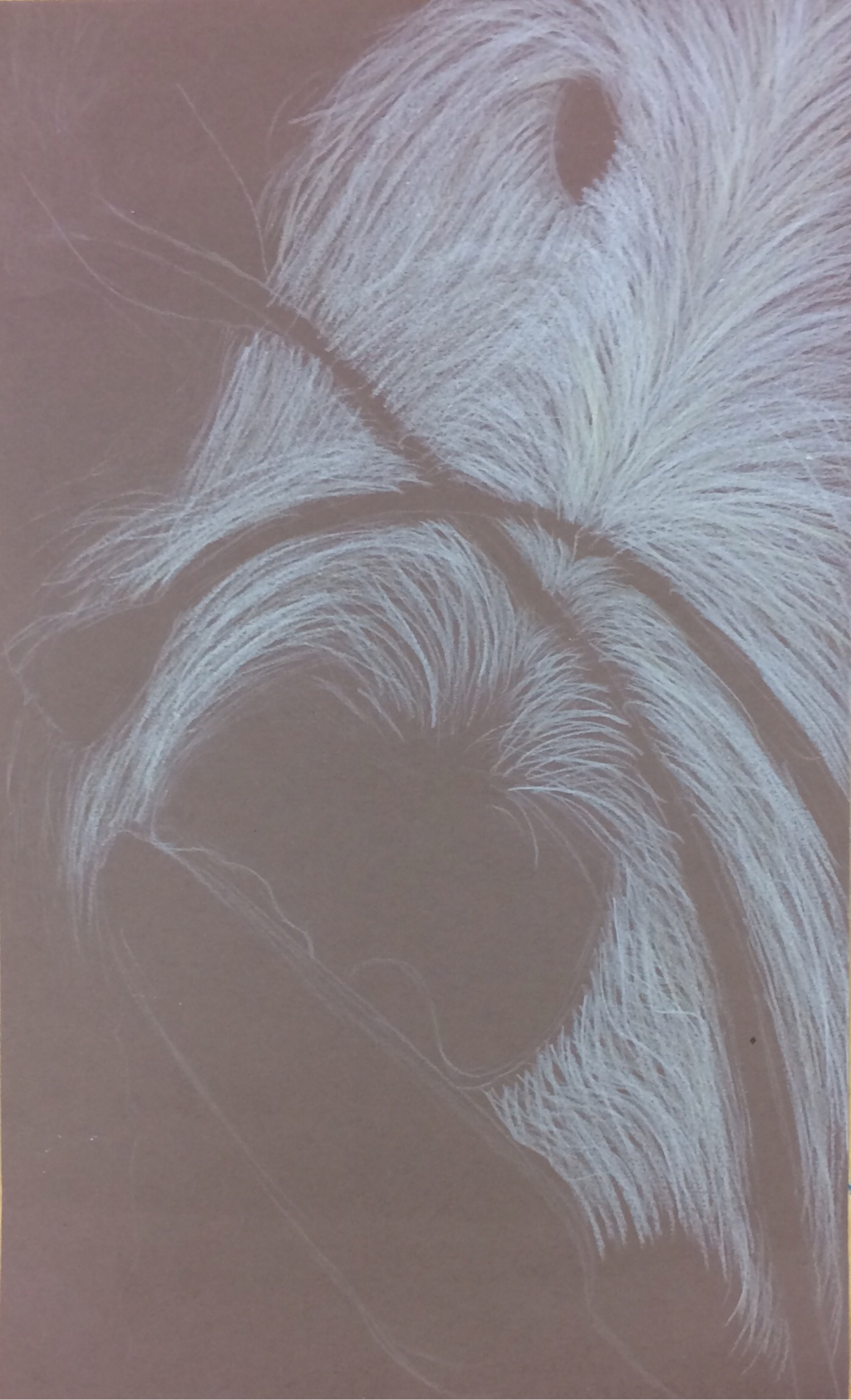
Stages and progression of the final piece for the O'Keffee project
Georgia O'Keeffe sketch before final.
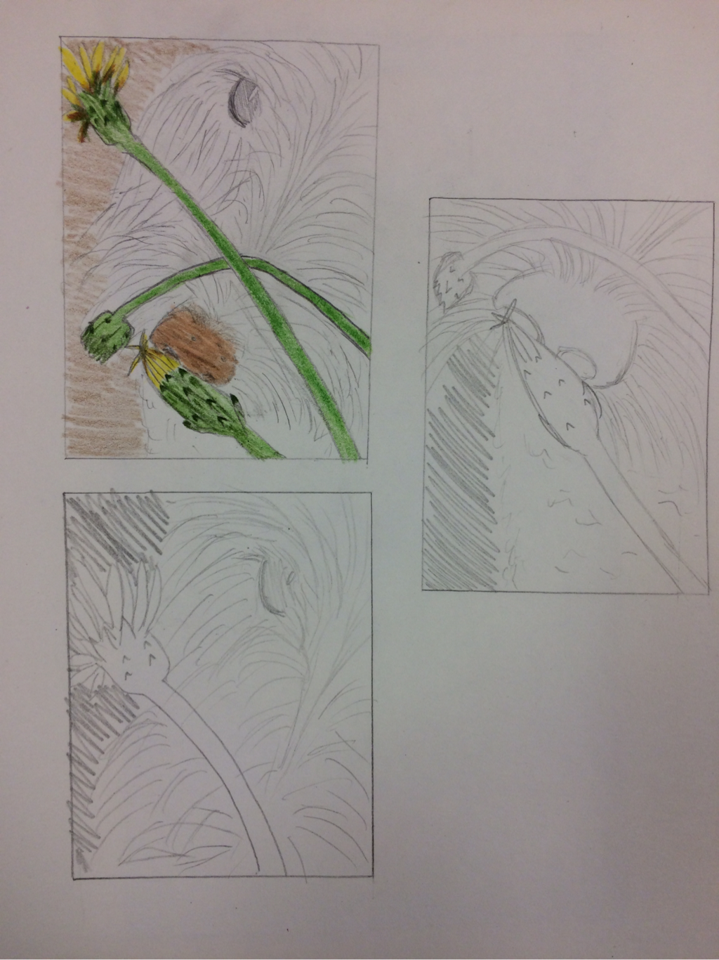
Sketches and pictures of chosen ideas.
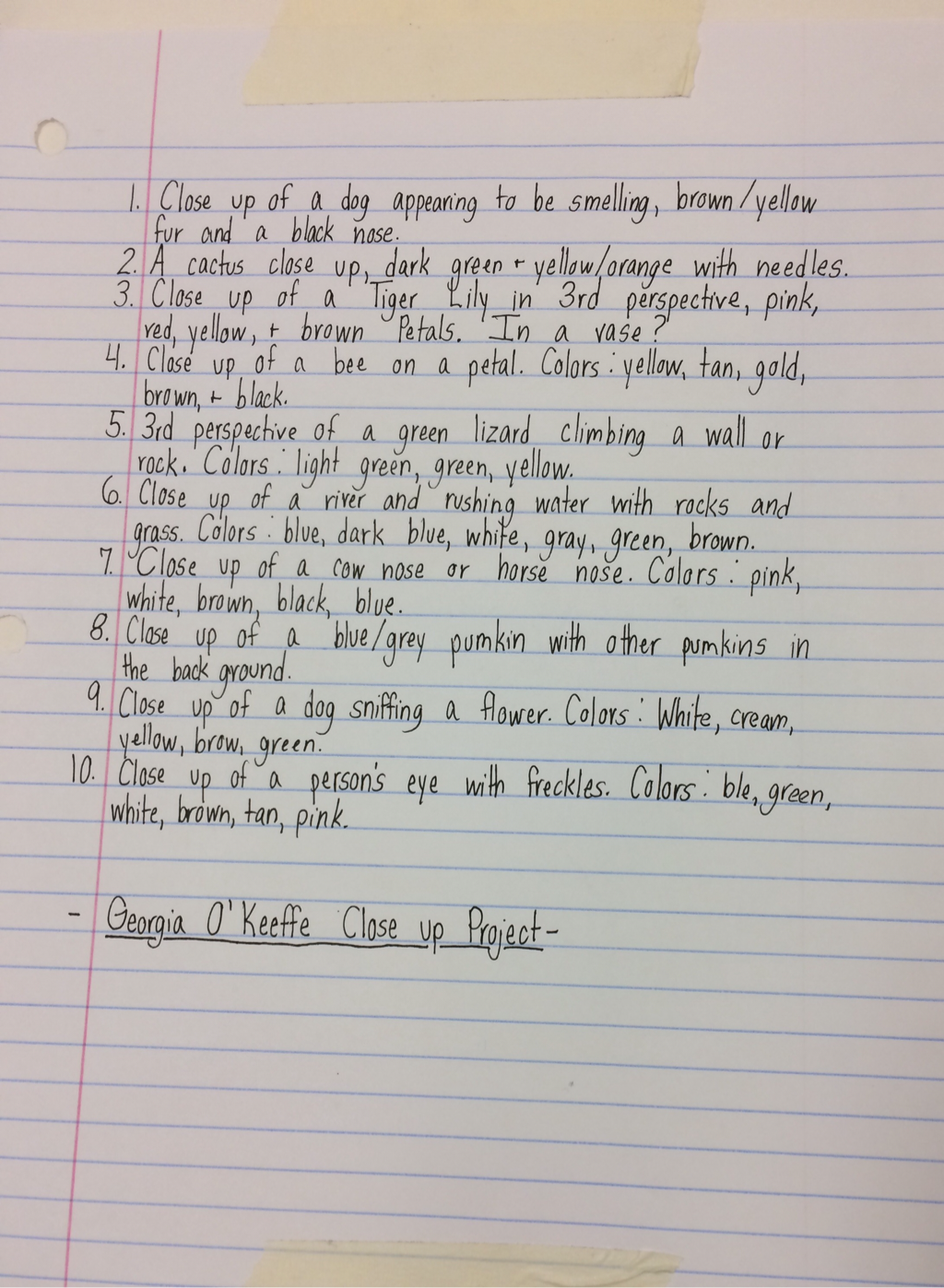
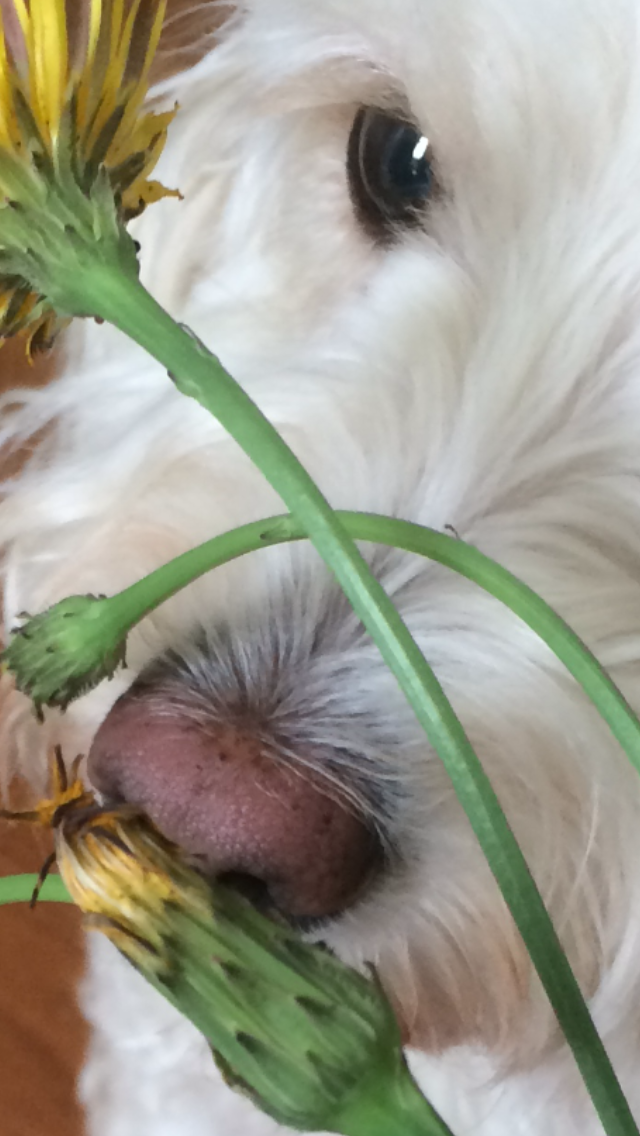
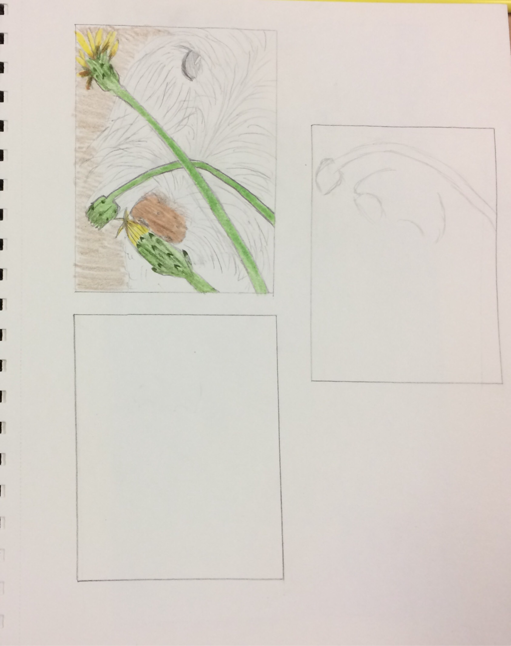
10 Ideas for the Georgia O'Keefe Close Up Project.
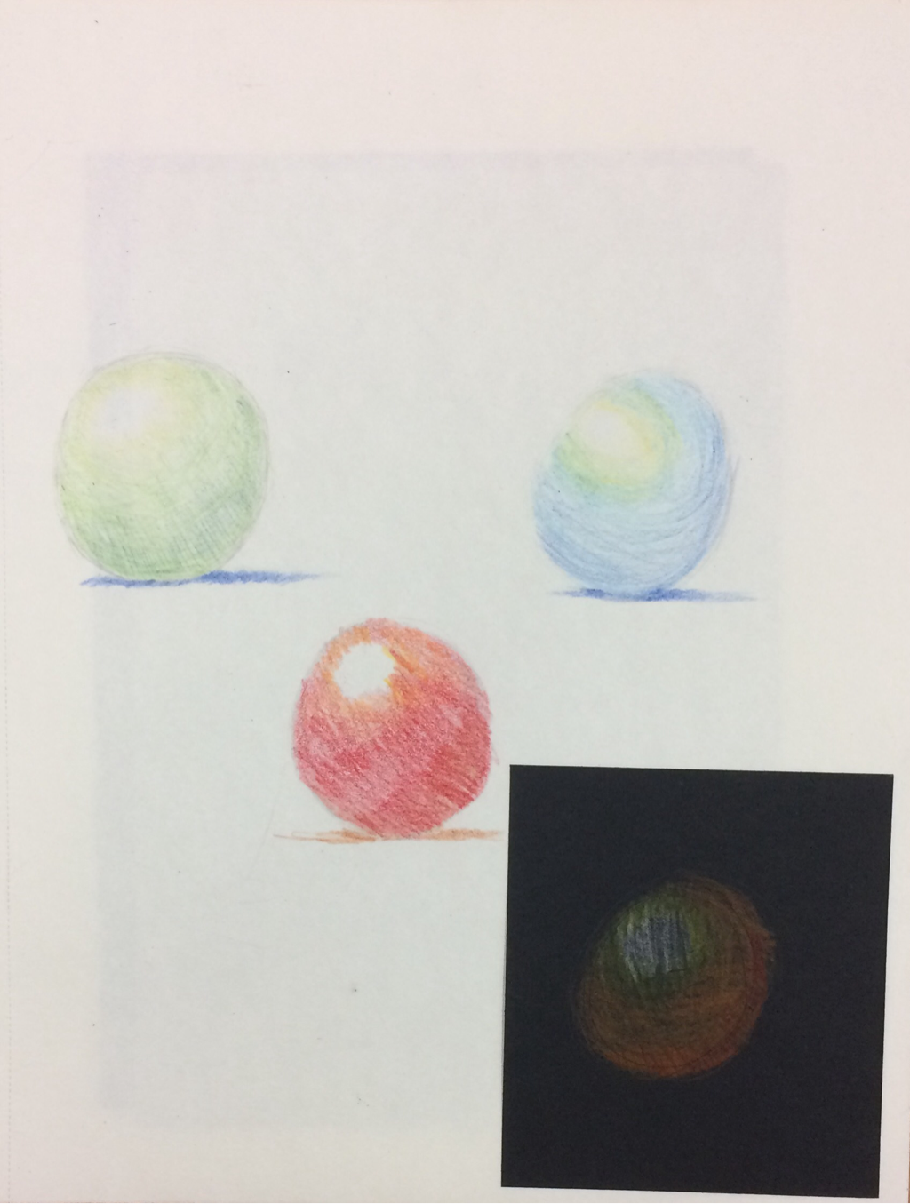
Color Spheres shading done in prisma colors.
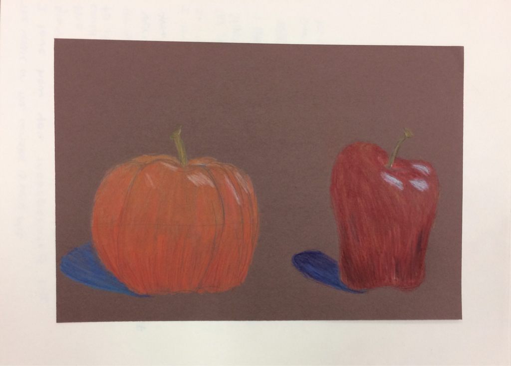
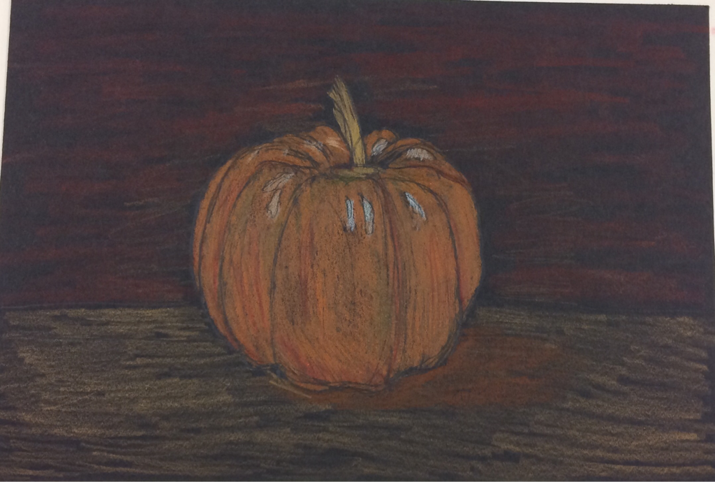
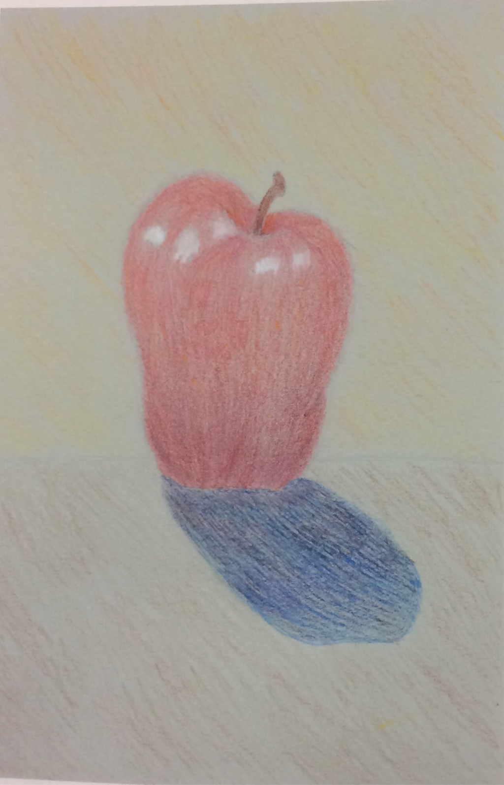
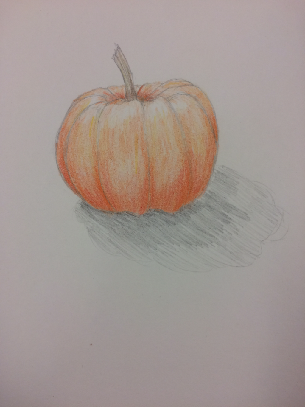
Color Pencil Fruits. These apples and pumpkins are done in Prisma color pencils and are shaded.
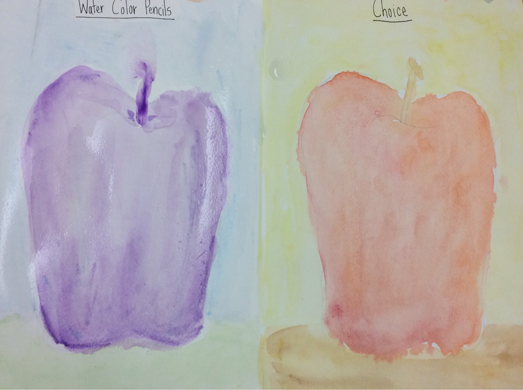
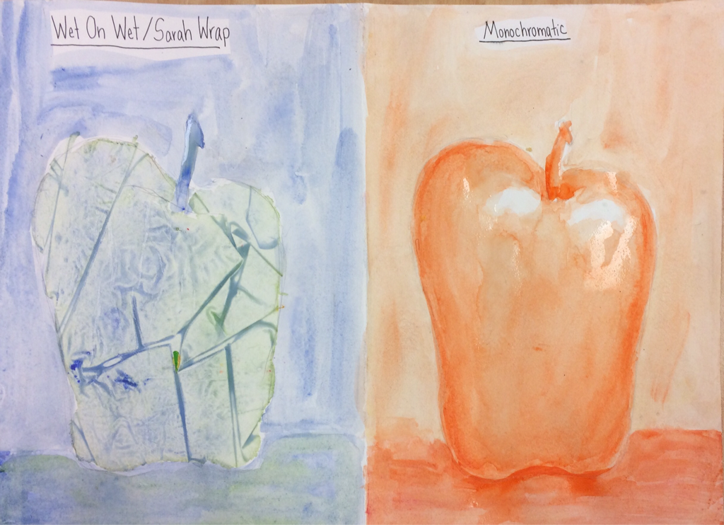
Wet On Wet/Sarah Wrap done in blue and green water color. Monochromatic orange apple using value techniques and highlights. Water color pencil done in purple value apple. Choice apple done using wet on wet technique with red and orange paint.
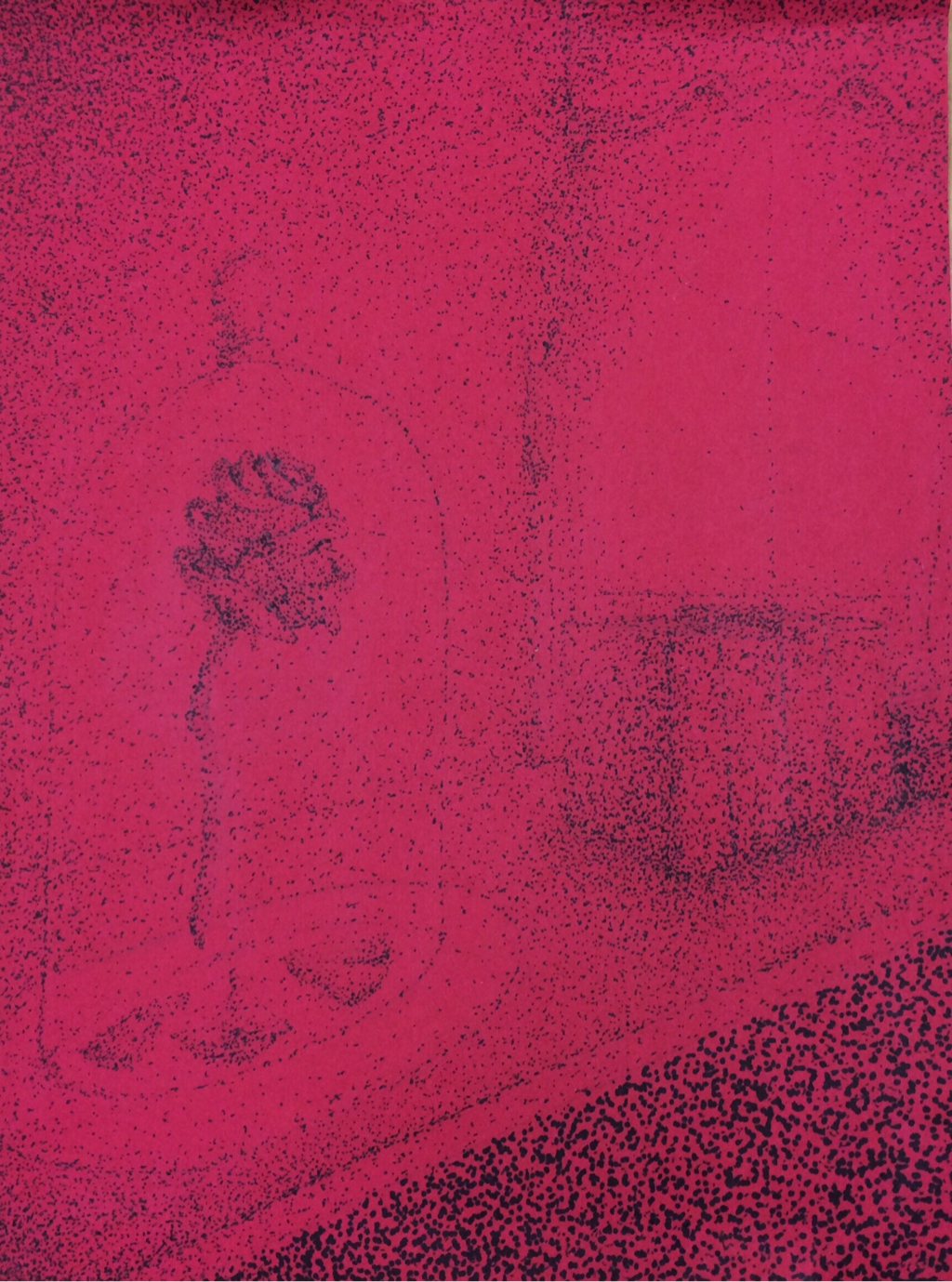
1. I chose stippling as my pen and ink technique because I liked how I could show value using dots. I didn't choose to use any other techniques because I wanted consistency and felt stippling was a great way to show the value of the room and rose.
2. I used second perspective to show the table going off in to the distance and the rose vase at angle. Perspective is important to show the object isn't just two dimensional and makes it more realistic.
3.Texture is important to my composition to show the fabric of the curtains and the softness of the rose.
4. Value is important in my project to show the depth of the table against the window, the rose in the glass vase, to show the conners are away from the window, and to show the shadow of the books.
5. My craftsmanship of the stippling dots made the dots without "tails". My dots are organized and controlled to shape reconizable object and to show value.
6. If I could recreate my piece I would add a wood like texture to the table, add leaves to the stem of the rose, and make the dots darker.
7. I created my rose and room that was inspired by the 'Beauty and the Beast' fairy. I represented the story in my own way by using the stippling technique, putting the rose on a table in second perspective, and adding books and an open window.
8. When applying the stippling pen and ink technique I need to know how the dots should look. It was important to understand the concept of the techniques so when you draw the final product you are not struggling and your artwork turns out how you envisioned in.
9. As a growing artist, the techniques I learned while doing this project will help better my future projects. I how know the importance of value in a ink drawing, I know how to stipple, hatch, or cross hatch. I can use these techniques later in the art class to create more pieces or draw on my own.
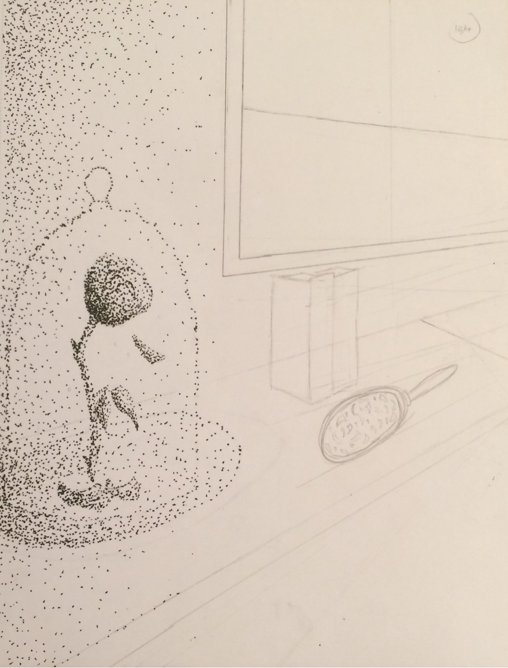
Rough Draft for the final sketch of the fairy tail drawing. The rose is drawn using second perspective, with some of the Beast's other possessions. Including books and the mirror going off in to perspective with the window. Using the stippling/ shading technique.
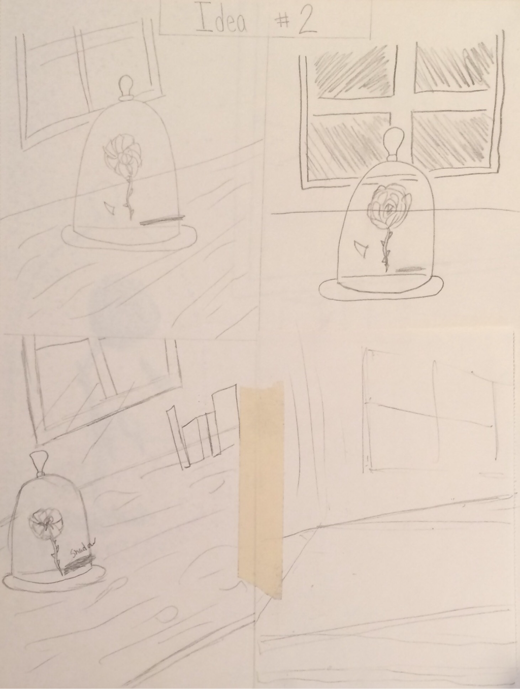
Fairy tail sketch #2: ideas for the rose from Beauty and the Beast in secong perspective. I wanted to draw the rose on a table with a window in the background to let light in.
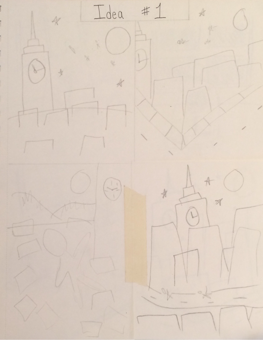
Fairy tail sketch #1: ideas for Peter Pan. I had the idea to draw Peter Pan, Wendy, and John flying over London (like in the movie) but using 2 point or 3 point perspective with 'Big Ben' in the background.
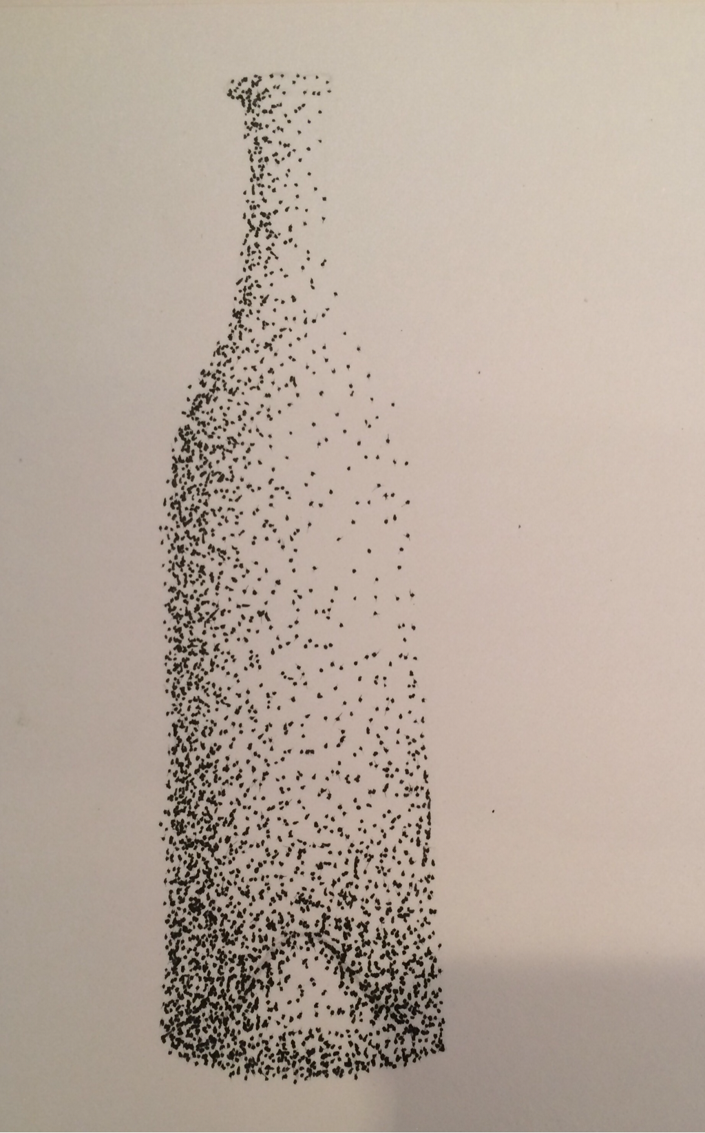
Stippling of a bottle done in pen with shading. 9/13/16
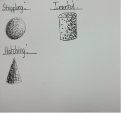
Examples of strippling, cross hatching, and invented drawing using shading technique (done in pen). 9/12/16
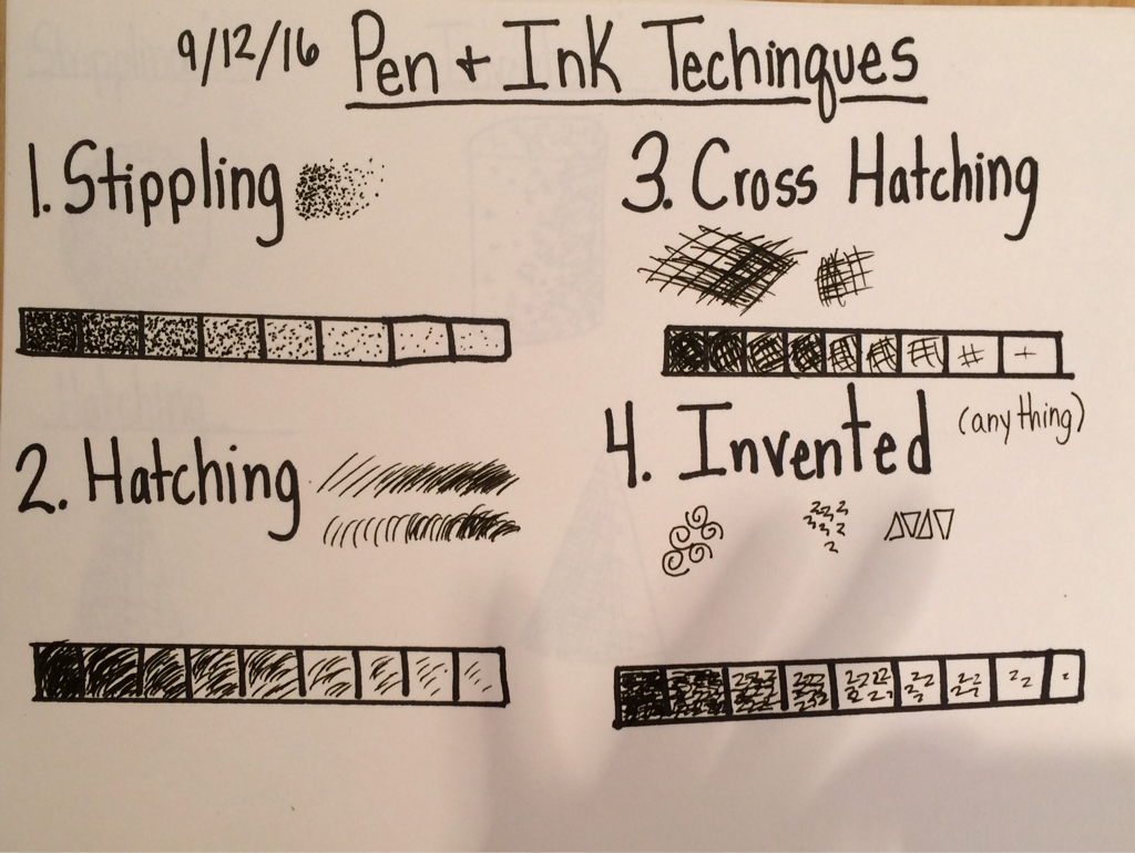
Pen and ink shading value charts done using different techniques, such as stippling, hatching, cross hatching, and invented.
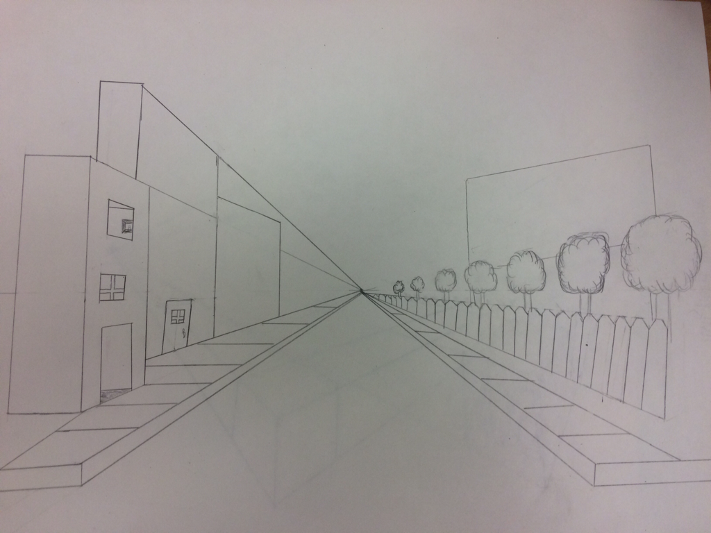
Pt 1 street scene: I decided to draw a row of builtings on the right side, contrasting on the left side I drew a neighborhood of trees. Both continued to the vanishing point.
Pt 2 street scene: I drew a corner building, it had the intention to be a shop. On the building I used the perspective technique to draw an open window and bricks on the side of the building.
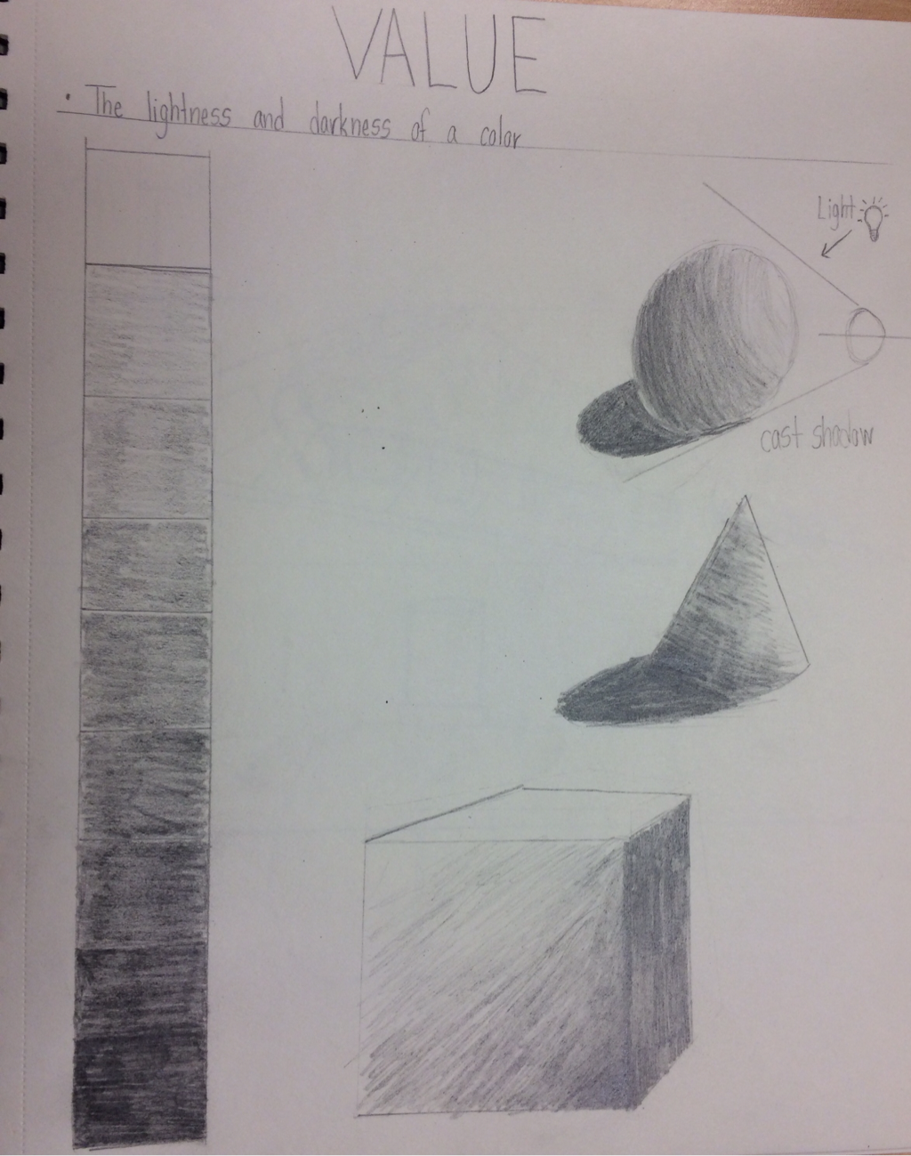
Shading Chart and Value Form Studies: I shaded the light and dark values between black and white. I also shaded a square, cone, and sphere using the pencil shading technique.
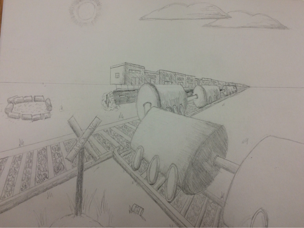
15 Shapes Shading Project: I chose to draw 15 cylinders and make them appear like train cars on the train tracks. To make up for the lack of train cars I drew a bond fire with cans surrounding it. To make my drawing have a realistic quality I drew shops to the right in first perspective.
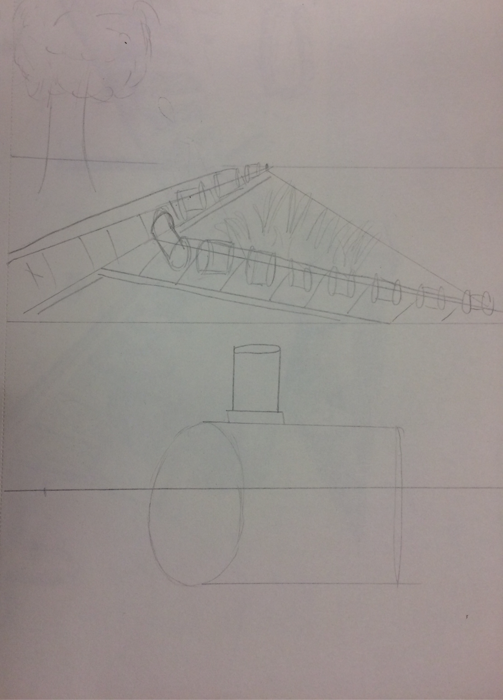
Sketches for the 15 shading shapes ideas: My two ideas were to use a cylinder to make one large train or use 15 cylinders to make train cars.
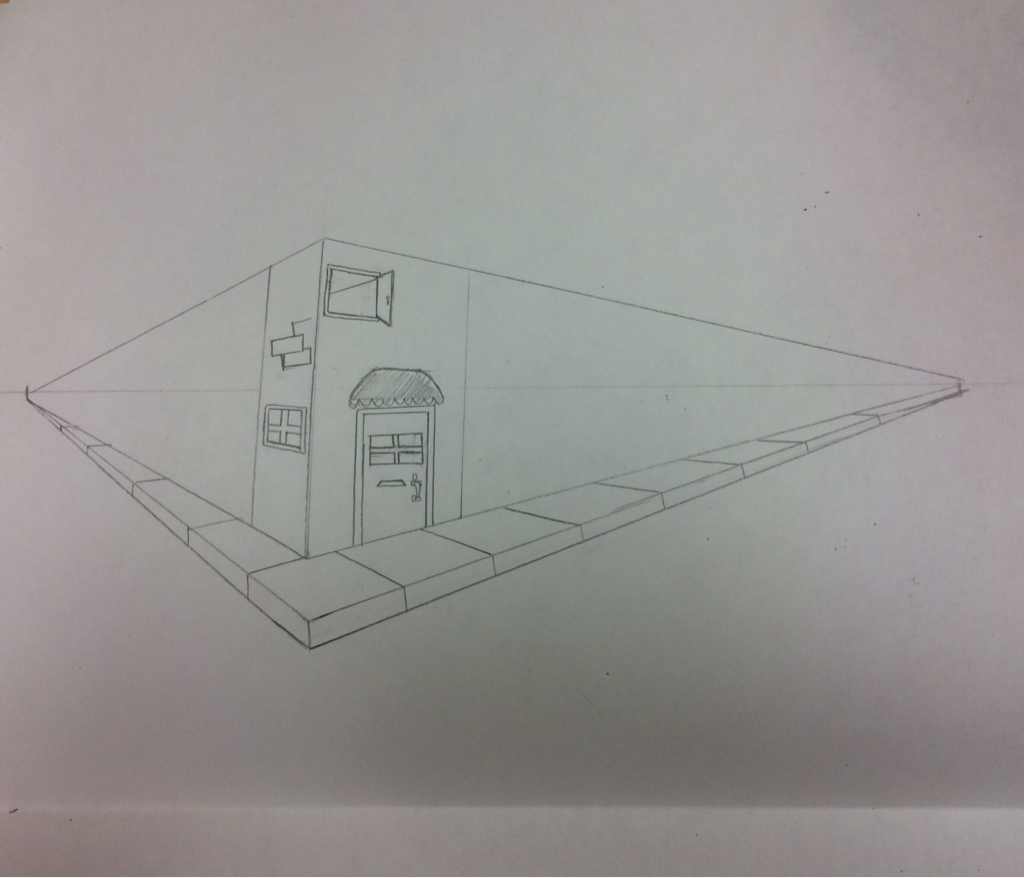
Pt 3 perspective example.
